Showing posts with label figures. Show all posts

Friday, February 10, 2017

Serious color fun

The Conversation
After obsessing about the detail in the last sketch, I really wanted to clear my mind out and do something completely non-objective and try to find a pleasing 2D design out of just color blocks. However, the instant I touched paint to paper I thought, I want to paint a giant bouquet. I roughed in the outline of a big vase on a table with curved legs—which turned into wishbones—and then added a backlit doorway with two figures conversing as they walk. I was trying to use up the leftover paint from the day before, but started with lighter values. It started out lighter than it finished; I wanted some darker shading in the background.

I did have trouble picking colors that looked good together. I started out with two hues of reds for the pinks, with a grayed pink for the left wall, but replaced that with a light lavender for a livelier harmony. After that I added peach for warmth and tried three different tints of yellows, plus peach and lime green, on the floor. On the bouquet I tried a few colors I didn't keep, then a few more that I left in small spots, and lastly the colors I chose for the dominant colors, yellow, orange, and lime green. I had only a general feeling of effusiveness that I wanted to convey, like the magnificent bouquets you see at flower shows  and gardening seminars.

As the layers of unsuccessful washes built up in the lower half and acquired their own patina I decided to exploit this de facto impressionism and play it up in the rest of the painting. That part was really fun; there's something rebellious about applying a color you know isn't the right one. I used to think that never being able to mix the same color twice was the biggest problem with acrylics; now I'm seeing it as a definite bonus. Most hues are semi-transparent at least, and when you use thinner washes you get a lot of the same effect as layering colored pencils.

Monday, January 2, 2017

Painting comes out of nowhere

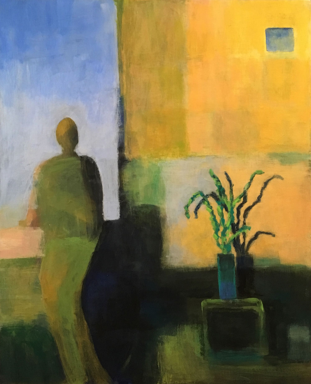
Southwest View
Ever start on a painting and think it's going to be a walk in the park, and then you find out the park is Denali National Park and you're getting dropped off at 18,000 feet?

I had one like that early in December—I repainted every part of it at least three times, and I was beginning to wonder, is this painting? Or trial by brush? Sometimes making a painting is an expression of joy; other times it's a test of my resolve. How stubborn am I?

Then I got inspired to work on one of my half-done book manuscripts, and left it—abandoned it, really—on the easel. Every day after that, I disliked it a little more and got more and more angry that I'd wasted a good 16x20 panel on such a conspicuous failure. The only reason I didn't paint over it at that point was because it was a concept I really wanted to do. So much for that.

Then just after Christmas, I was sketching with my brand new Pitt Pens with brush tips that I got myself for Christmas 😀, and got an idea to do a self-portrait with a plant. I set up my paints again and started painting over it. I blocked in a figure and a plant, and then a bunch of abstract shapes in the background, thinking about how I wanted to rough in the dark-light balance and decide on colors before I started shaping anything. Within an hour of completely relaxed, fun painting, I had a rough composition that I liked very much just the way it was. It didn't look anything like my initial sketch, but so what? I wanted to leave it rough on the figure and background, but wanted to make the plant and pot more defined, adding a shadow to emphasize the idea of bright, sharp light and a defined space. The only change I made after that point was to add the little window to make the top part of the painting as important as the middle and bottom.

I kept remembering what Burridge says, "Don't fall in love with it too soon," but I really was in love with it. I did keep playing with the image in photoshop, to see if I wanted to change the colors or add other elements, but I didn't want to. When I got it to almost final, I showed it to a couple friends and they both liked it. So here it is. It's so completely different from anything I've ever done that I'm still getting used to it. I'm thinking of it as minimalist. My first minimalist painting.

BTW, I really do love my Pitt Pens. I had ordered two small manga sets from Blick, and enjoyed playing with them enough that I decided to make myself a custom set and ordered 25 more colors in the regular brush tip, including a big size "opaque" white pen. It's only semi-opaque, but still quite useful for lightening and adding highlights. You can get very fine lines with the brush tip, or nice 2mm strokes, but if you only want to do fine lines, you can get a few of the colors in a superfine nib. They're $2 each, less in the sets. I bought a small Strathmore 300 Mixed Media Pad and it's perfect for them—no warp, no bleed-through. The only thing about the pens I wish is that they had pale colors in more hues, but that's where the white pen comes in handy. I love having different shades of grays to sketch with, especially trying to do faces.

I hope to do a lot more sketching this year, both to play and to rehabilitate my now very rusty drawing skills.

Friday, September 23, 2016

Painting from the imagination

Blue and Orange
I've been practicing creating paintings without any references or preliminary designs. I wanted to try both a floral and a figure painting. I chose simple color schemes and just started drawing on the canvases with a paintbrush, sketching rough outlines and then blocking in the colors. I intended to work loosely, and wanted to see how lively I could make each painting.

After painting from photographs for so many years, I'm excited to see what images I can come up with just by working first and thinking after.

The vase and flowers came together really quickly, and the only repainting I've done is to balance the pattern of flowers and add bits of the accent colors.

Out Of The Rain
The figure painting took several days, and while I liked the design and general color scheme immediately, I had trouble making it interesting enough for its large 16"x20" size. I tried several tricks from Robert Burridge's website videos, and each one of them was very useful. The first one was using alcohol in the foreground to create the splash effect. But I still had a flat, featureless background where I wanted to add texture and interest without adding any detail. I found it impossible to imagine a satisfactory pattern, so I got out a soft pastel and just scribbled a looping random pattern of circles over the whole painting. I took different shades of pale yellows and oranges and just filled in the circles to look like vague and maybe blurred light sources. It was simple to remove (with a wet paper towel) or paint over the remaining pastel lines that I chose not to use. I've never used pastel on a canvas before, but I'll certainly do it again. In fact, I'm looking forward to playing with it a lot more.


I did wonder why it was so quick and easy to paint the background on the flowers and so hard for me to figure out what to do on the figures. On the flowers, I knew I wanted a gradation from light to dark,  and instinctively threw on a bit of violet with the blue, and those two things provided enough variation in the proportionally smaller background. But with the figures, there's a lot more background, and though I put in a range of colors at the beginning—almost white to shades of yellow and pale orange—it just wasn't adding enough to the design. The only idea I had was of building lights, but that was more detail than I wanted. When I decided to try the pastel to generate a pattern, circles were simply the first thing I thought of, and as I drew them, I could see how they supported the feel I wanted, that it was really all about the figures. I didn't need to imply direction or movement or any other objects, I just wanted a supportive pattern. And that's what happened.

I think the point is that any painting can present challenges along the way, and it isn't always easy to come up with solutions. The more things you try, the more ideas you're going to generate, and trying things generates ideas much more quickly than thinking.

The last trick I used was streaking with a cheap decorator's brush to create the effect of rain falling.

I've really profited from Burridge's videos. You can find them HERE.