Friday, February 24, 2017

Finding out what you don't know

Floral 8
Finding out stuff you don't know is a great reason to do sketches. It also feels like a whack in the shins because there's a good chance you're going to get something you're not going to like. The goal of creating a painting you like evolves into the goal of finding out what you need to work on before you can accomplish the previous goal.

I found out I have a very incorrect image of daylily blooms in my head. I see a couple hundred daylily blooms every year in my garden, but the only way I ever looked at them was face on. No matter how much I tried to paint them from the side, I couldn't make them look real, because I had that shape completely wrong in my head. I managed to google some references online so I could finally finish it, but only after painting them all wrong a few times.

I just kept thinking, if I really understood the structure of this flower, I could paint it much more quickly with many fewer strokes, and it would look more alive.

So, this year, to become a better painter of flowers, I'm going to be cutting more flowers, bringing them inside and taking photos of them from different angles, and sketching them until I have all those  shapes in my head, ready to use any time.


Tuesday, February 21, 2017

Lessons from the imagination


This was another interesting journey into the unknown. My intent was a loose floral sketch in a new color scheme with a dark background, and to start without drawing, make color blobs and see what developed. I started with mahogany—blackened red—for the dark upper background and instead of the complement of green, I chose a split complement of yellow-green and blue-green. When I went looking for other colors for accents, I added yellow-orange and a grayed blue-violet to complete the harmony.

As much as I was enjoying the way the colors played together, it chafed me that I had chosen such an unrealistic color for the flowers. There are many kinds of green flowers, but none like these. But instead of restarting I chose to stay with it and see if I could make another interesting composition out of it, as an experiment, to prove to myself that reality is not necessary to make an eye-catching painting.

In my last painting it seemed that a contrasty light-dark composition was what attracted my eye most strongly, and I wanted to test that in a different set of colors. Whenever I got stuck wondering what I wanted from this painting, I knew it would have been easier and quicker to copy an image I already had. Because I couldn't do that here, I had to let my imagination guide me. But, if you want to grow a muscle, the best way is to use it, so I chose to paint what did come out, and it was these giant mutant primulas.

The hardest part on this one was creating the light-dark pattern from my imagination—I don't seem to have any facility for that at this point, and that's one of my big motivators to do all these sketches. I went through several stages of moving the light areas around, shrinking them and growing them. When there was too much light, the painting lost its center and looked like a less interesting piece of a larger painting. I had to surround the flowers with dark in order to keep them inside the frame.

I also wanted to play with outlining, as that seemed another way to draw attention to particular elements of a painting, to be a substitute for detail. I can tell that it definitely works for that, just as shadows do. But here, it was really too much until I strengthened the lines on all the stems, and outlined the orange flowers in a less dramatic color.

This is why I'm sketching—to learn all these lessons. Now I have more ideas to play with as I'm working out my next compositions.

Friday, February 17, 2017

No more detail than necessary

Dainty California
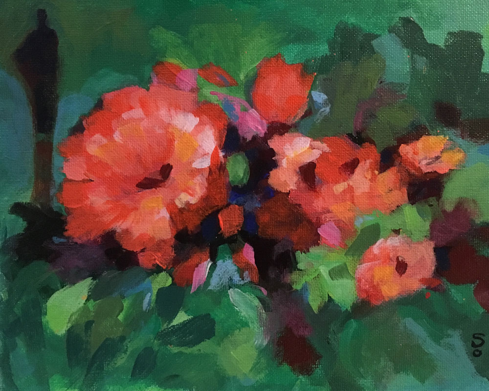
I realized last week, watching two of my earliest camellias opening beautiful flowers, that most of them are big and bushy enough now that I can prune fairly long branches off them with no noticeable effect, so I started bringing some inside to enjoy, since it's mostly too wet to go outside. I took a couple photos of this little bouquet the other night against a dark window, and decided to paint them against a black background.

I had to rearrange them on the paper though, to make a nice composition for 8x10, and I was feeling the need to draw it first so I moved the flowers around in relation to each other and took some liberties with the leaves, besides inventing the round vase. For colors, I figured red, green, and blue, and made the top a blue-black with the same cobalt on the table. I started out with a pink vase but in the end added just enough yellow to make it more coral; the golden yellow stamens add a nice balance for the blues. I have a tiny glass frog I added, in a sort of homage to our local tree frogs.

I had fully intended to make another loose, impressionist-like sketch, but once again, what I was planning simply did not happen. After I blocked in the colors over my charcoal drawing, which was more precise than I expected because I needed the drawing practice, I felt like I was being pulled back to the super-careful brushstrokes and slow, tedious painting I'm so tired of. I stopped working on it for a few hours until I could shift my mindset to be, okay, you have exactly the composition you wanted, now just start slopping on the paint, like you've been doing in the other sketches. That seemed to break the spell and I was able to pick up a brush and just relax and put the colors on where I thought they should go. It was easier than I thought. I did try to make mindful strokes, but fairly loose ones, and not worry about whether they came out right, knowing I could always paint over them. The work went quickly and I was able to get it almost complete within a few hours, and yet it looks like I spent a lot more time on it than I did. The colors were simple, and the backgrounds too, and that helped. So it wasn't tedious, it was relaxed and fun, and I actually enjoyed doing the few bits of detail.

I love the dark background, and having that seemed to make it easier for me to put in natural-looking shadows. I did touchups on it for another couple hours this morning. Except for the stamens and the frog's toes, there's almost no detail, and I like that about it. So I think it still qualifies as a sketch since it took just over one day. I could probably spend a lot more time on the patterns on the petals, but it looks like camellias, and that was the main thing I wanted. I wouldn't want to have to put the sawtooth edges on the leaves, but that's probably what I would have tried to do last year. Enough is enough.

Tuesday, February 14, 2017

Get your scribble on

Floral 6
This is starting to feel like a whole new ball game. I started with color blobs again, yellow, blue, and red, aiming for an off-center floral with a lighter background. My goal was to get a more open bouquet with fewer, more interestingly-arranged flowers, not the symmetrical bundles I seem to be locked into, and to attempt a glass vase, all very loose and energetic.

While I was working up the background, I rediscovered the joy of scribbling. Some people are doodlers, but I was never a doodler, I was always a scribbler. Sometimes I think I'd be perfectly happy just piling one layer of color over another, completely covering the one before, just scribbling with the brush, but I've never believed that that would actually produce anything one would call Art. Maybe I'll try it someday, but in the meantime, I did find it very satisfying to abandon all discipline and just scribble the background in.

When I started painting the flower blobs, I still couldn't stop myself from painting a big round bundle that looked heavy and solid, and had no air in it at all. So I left it to dry and came back later with the light blue background and painted out about a third of the flowers, and that improved it greatly. But I didn't like the pale yellow and peach in the background and table so I darkened them to where they are now and worked up the vase. When I stopped at that point last night, it was clearly the best floral I'd done so far, but it still looked like it had a little headache or ate too much the night before—just a little off color.

I didn't figure out what the problem was till I'd looked at it on the computer. I had used a pthalo blue in the top background, and cobalt on the flowers. I decided to try switching the pthalo to a cobalt wash, and bingo! That was the problem. I've combined those two colors in a lot of paintings and they've worked well together, but they really didn't in this mix, at least not the way I was using them. I also darkened the tone of the top blue, which popped out the flowers more.

Saturday, February 11, 2017

From color blobs to abstract

Landscape
This time, I did begin by painting color blobs. I started with greens and only expanded to yellow and pthalo blue, plus black for the fern greens. I started out with a lighter blob at a typical center of interest point and then surrounded it with darker blobs. I built outward from the center till the paper was covered, then added the rectangular blocks. At that point I felt like I liked the composition, the light and dark patterns, and was really happy with the colors.

I also thought it reminded me of an aerial view of a complex of buildings in a green landscape. Today I decided I just wanted to clean up the edges, overlaying lighter or darker colors to please myself. I drew the few lines to support the idea of structures, and to draw the eye toward that left yellowish block. I'm trying to remember to only put detail around the intended center of interest.

At last—an abstract sketch! From color blobs! With a design I like, which was my goal.

Friday, February 10, 2017

Serious color fun

The Conversation
After obsessing about the detail in the last sketch, I really wanted to clear my mind out and do something completely non-objective and try to find a pleasing 2D design out of just color blocks. However, the instant I touched paint to paper I thought, I want to paint a giant bouquet. I roughed in the outline of a big vase on a table with curved legs—which turned into wishbones—and then added a backlit doorway with two figures conversing as they walk. I was trying to use up the leftover paint from the day before, but started with lighter values. It started out lighter than it finished; I wanted some darker shading in the background.

I did have trouble picking colors that looked good together. I started out with two hues of reds for the pinks, with a grayed pink for the left wall, but replaced that with a light lavender for a livelier harmony. After that I added peach for warmth and tried three different tints of yellows, plus peach and lime green, on the floor. On the bouquet I tried a few colors I didn't keep, then a few more that I left in small spots, and lastly the colors I chose for the dominant colors, yellow, orange, and lime green. I had only a general feeling of effusiveness that I wanted to convey, like the magnificent bouquets you see at flower shows  and gardening seminars.

As the layers of unsuccessful washes built up in the lower half and acquired their own patina I decided to exploit this de facto impressionism and play it up in the rest of the painting. That part was really fun; there's something rebellious about applying a color you know isn't the right one. I used to think that never being able to mix the same color twice was the biggest problem with acrylics; now I'm seeing it as a definite bonus. Most hues are semi-transparent at least, and when you use thinner washes you get a lot of the same effect as layering colored pencils.

Wednesday, February 8, 2017

A different canyon, a very different experience


I wanted to paint this canyon as soon as I saw it; it seemed like the archetype of a high desert canyon. I picked it for my second try at Zion and was hoping for another short and easy sketch, but by the time I had five hours on it and it still didn't look anything like I wanted it to, it obviously wasn't either.

I decided it must be a problem-solving session for painting rock formations, and that's something I want to learn to do, so I just kept working on it. The big question in my mind was, how much detail should I put in? I guessed the answer is, however much as pleases me. I had to try to find a balance between the endless textures in the photo and the minimum amount required to make not a quick sketch, but a painting. It lacked the strongly delineated shapes of the last sketch, so it seemed that I would have no choice but to work on the surface textures of the walls. I put in what seemed like a medium level of shapes, feeling like I should concentrate the detail around the canyon opening. After that I spent quite a while first figuring out the colors, and then contouring the shapes. I left two areas without any detail just to see how they would compare with the rest, and I decided that was not enough detail.

There was one area I just couldn't get to work with the other sections, and I stared at it for a day without getting any ideas. But the next morning I woke up knowing I was ready to gamble that something good would happen if I just kept working on it. So the first thing I did that day was cover the whole area that didn't work with a wash of dark red. Immediately it not only fixed the problem, it completed a larger pattern of blocks of color that I hadn't really noticed beneath all the textures. It occurred to me that the design of this painting, rather than being lines, was the shape of those color blocks.


A couple of the sketches I've done lately have had more interesting compostions that I had in mind when I started them, so I've spent some time studying them. I'm going to try and keep track of the ones that I like.

Sunday, February 5, 2017

Working with reds

Floral 5
I wanted to try another imaginary floral, this time with reddish flowers. I went with greens just to use the pair of complements, and the orange  and pink bits to extend the range of the reds, but I was hoping to work in some blue somewhere. I worked up to it with blue-greens in the background, then some touches of cyan in the flowers. At the very end I added a few small spots of darkened cobalt right in the center. They are barely visible, but they did have the effect of perceptibly enhancing the color balance.

I never realized how complicated it is to make pleasing compositions from my imagination. I think next time I'll spend a bit more time in the rough blocking-in color-blob stage. But even in a painting with no real detail, it's hard for me to imagine how it will look as a finished piece, and I'm guessing that I'll be playing with a lot of these before I start getting the hang of painting without a reference.

The part I had the most trouble with was making a pleasing pattern of darks around the flowers, and I had to play around with them quite a while, and I think that's why I put the background figure in. Along the way I realized the flower arrangement didn't seem balanced, until I added the smaller dark red flower in the center. I wasn't sure what color I should put in there, but knew it shouldn't be the same red & orange shades as the others. When I put in the dark red, I liked how it added another shade of red in the mix.