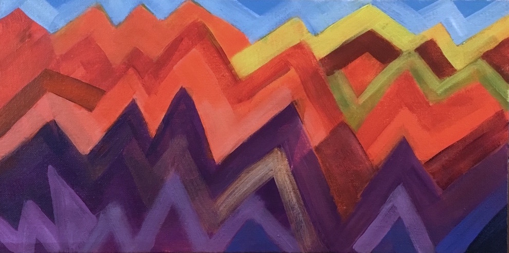
Sunday, May 28, 2017

A new gorge sketch


Here's another of the sketches I worked on early this month, still playing with blue and orange. The scene is looking east from Catherine Creek State Park (again). I stripped out the trees, so the focus is on the shapes of the lands and light, and the sunrise colors.


Saturday, May 13, 2017

Orange with yellow and green

Orange Border
I've been working on three of these 8x16 panels at once, having had three different ideas at the same time. Two of them took several sessions to finish, this imaginary floral and the one I'm posting next time. After making Chili Drawer so dark (somewhat unintentionally), I wanted to explore some higher value oranges. BTW, yesterday as soon as I picked up my brush to paint, I realized why it had come out so dark. I have a lot of light in my studio, partly because it makes it easier for me to see the brushstrokes as I make them, and partly because the colors show up better, both on the palette and on the easel. I have a flex-arm desk lamp on each side of my easel, and got into the habit of turning so part of the light falls directly on the canvas from less than 3' away. That's a lot of light, and it's a lot brighter than anywhere else in my house. So of course when I take a painting off the easel to look at it elsewhere, it looks a whole lot darker. I rearranged the two close lamps so they don't shine on the painting, and added one more light farther back over my shoulder to make it easy to see my brushstrokes. So far it's helping.

I wanted to try a long floral example, and use the greens I'd been leaving out recently. I repainted the center several times, and didn't get it right till I put those dark maroon touches in the center top flowers, and added the pale yellow portulaca—or whatever it is—that's near the center. I had split the composition in two and had to pull it back together.

As I was learning to make red-oranges on Chili Drawer, I was painting them in these flowers. Technically, I was working on four different paintings, and I liked it—three of them being small made it easier—because you can use things you learn in one, in all of them, if you want to try something more than one way. It also makes it easier to keep painting and still let your paintings dry when you need to, which I need to do often.

Sunny Day Magic
The other panel is this one, that I just wanted to try and see what it looked like. I knew it would be fun to paint. The colors are pretty much the same except for having more blues in it. For some reason I really like it. The little wiggles remind me a little of the playfulness of Klee, and I like all the colors next to each other and the vibrating energy in it. It's like molecules of Spring in bright, sunny air, a mix of earth energy and sunlight. It was fun, and I can see myself trying more of these, on big canvases, just playing with colors.

Wednesday, May 10, 2017

Playing "Why don't I like this painting?"

Chili Drawer
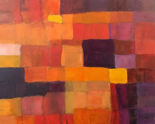
I was ready to try a larger (16x20) abstract, something very simple, but a deeper exploration of the color range of oranges. I divided the canvas panel into a grid and started painting every shade of orange I could come up with, plus deep violet, which is really a darkened red violet.

When I finished the first pass, I wasn't happy. I decided the rectangles were too small and too many.

I took black charcoal and and drew a new grid, with fewer lines, giving me fewer rectangles with a wider range of sizes. I let it sit like that till the next day, all the time feeling like those charcoal lines over the colors were the most beautiful thing I'd ever painted.

But I also realized that in normal evening roomlight, I could barely make out what was in the painting. I had used so little white, wanting more intense colors, that only the yellow bits and the pale orange were visible; everything else looked like shades of dark brown. It was a values nightmare.

The next morning I looked at it and went "Ew!" I hated the lines—it seemed to be all about the lines—there were too many, too dark. In fact, I was so disappointed with the work that I had a little crisis of confidence—Why had I been so happy the day before with what was obviously awful?

So I took the colors I already had mixed and added varying amounts of white into them and repainted all the rectangles lighter—some a little, some a lot. I deliberately made all the lines except some of the ones around the edges either fade a lot or disappear. I also took advantage of the first grid to make a couple translucent overlapping shapes and some fairly small rectangles to make the design more interesting.

As soon as the lines started disappearing I realized that drawing them had been a good thing, they just weren't finished—they were just an intermediate step to a better version. The painting went from crap to promising in less than fifteen minutes once I started working on it. I realized then that I would start liking it again when it was a "good" design—one that I thought was interesting.

One more reminder to just keep painting when I do something that doesn't look good.

During this step I literally discovered red-oranges. For some reason I had really never gotten around to playing with red-oranges, and found several discernible hues I could reliably mix. That extended my palette enough to do a large number of unique rectangles without going all the way to red.

When I fixed all those problems, I noticed an as yet unnoticed grouping of rectangles that I wanted to repeat, so I found a similar grouping and re-colored it so it connected visually to the first one.

I've already used some of those red-oranges in another painting I'm in the middle of struggling with, so that was well worth the learning.

Friday, May 5, 2017

Exploring more orange "chords", with purples this time

Mountain Ranges
I wanted to get more experience with all the wide variety of oranges available, from yellow-orange to red-orange, and wanted to pair them with purples in a new bunch of sketches. I also wanted to play with more ideas for abstracts. This idea I had fun with a couple years ago with Volcano Country; I've always loved living around mountains, and much of my time in the western US has been with some visible from my home.

Orange and the violet used in this sketch are two thirds of a triad. For this one I threw in some single-color accents of yellow, yellow-green, and blue, just to see how they went together. Yellow-green and blue are half of a tetrad with orange (and red-violet, missing here.) I subscribe to the idea that color combinations are completely analagous to chords in music, and that you can get a lot more interesting  art when you use more complicated harmonies. Sometimes what you leave out is as important to the feeling as what you put in. But whether or not any combination actually works in a painting depends on placement in relation to the other colors, relative size, saturation, and how it supports both the subject and the idea of the painting. Only seeing and feeling it can tell you if you've hit the mark—you have to play to learn.

I think if I moved these colors around in the painting I could get several different moods, as I could if I used different values. It's a mix that carries a lot of energy and seems to beg a lot of "why?" questions, which really stimulates my imagination. Orange suggests earth and sex; violet points to spirit and the higher mind. Orange feels grounded and practical; violet leans toward infinite space and unbounded imagination.

One thing for sure—I'm never going to get tired of color.