 |
| Haystack Rock 12"x12", oils on canvas |
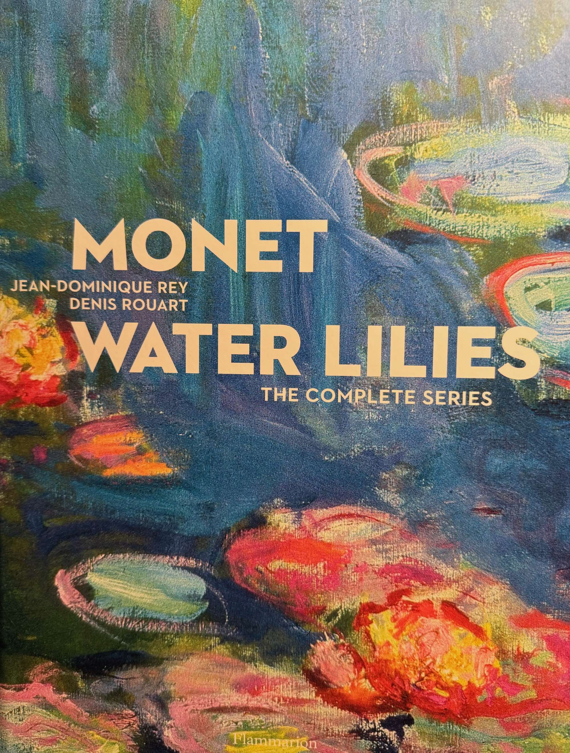
I was looking for some new ideas for landscapes and also wanting to do some work with water, I decided to do some of the Oregon coast. I happened on a news article on Monet's water lilies and procured a used copy of "Monet Water Lilies - the Complete Series" by Rey and Rouart. I drooled over it for two days straight, trying to absorb the meticulous looseness, the freedom of not-necessarily-realistic colors, and the magic of the water's surface, the reflections and ripples. He was one of the first painters I studied and he's always been an inspiration to me.
Getting this book means I can stare at the lilies as much as I have time for—it's unlikely I'll ever make it to France! Sometimes parts of a painting look clean and spare, with just a few colors, or very similar pastels that relax the eyes and and the mind. Other times, in dark areas, it looks almost brutal, heavily overloaded strokes of colors that don't seem to make sense, but still convey deep mysterious darkness, lifting up the lighter areas and maximizing their impact. I feel like he's using color as a structural material, and I get the impression that he didn't have any qualms at all about using whatever colors he wanted to, whether his eyes could actually "see" them in the subject or not.
I wanted to paint Haystack Rock in as impressionistic a style as I could manage; by that I mean I wanted it to be loosely done, with vibrant, engaging color and simplicity of shapes, using texture and light to evoke a sense of presence. It seemed to me that his approach on the lilies was to lay in the water first with unstructured strokes, mixing many hues of blues, greens, lavenders, and then more-or-less draw in the flowers and lily pads with dry-brushwork, layering strokes until he got the depth and mix of colors he wanted. He doesn't bother with small details, letting one stroke suffice wherever possible, implying rather than stating, which in his hands conveys not just the water and plants, but a three-dimensional space and the feeling of looking at the subject as if you were standing next to him.
Another modern who impresses me in the same way is Sargent; his economy of strokes really amazes me, and it's a skill I really aspire to. I've heard over and over that suggesting the subject and surroundings engages the mind of the viewer more than explicit detail does, and enhances their sensation of the painting; I believe that is the the way vision works--you can take in a whole scene or you can focus in on one thing at a time.
Now that this one's finished, I'm starting another Haystack Rock, so I can explore other color palettes and more water formations, hoping to get closer to that magic that Monet was such a master of.


