Tuesday, June 26, 2018

Balancing rocks for depth


Working on the foreground rocks has been interesting because they need to attract the eye and lead it  into the painting, but they can't attract the eye back down once it gets to the butte face. They have to be detailed enough to be interesting, but not enough to be more interesting than the butte. They need to be relevant to the design, but not stand out.

They're not finished yet, but I believe their shapes are defined enough now. I started by using dark gray washes to fill in and darken the whole foreground masses. Once they were sufficiently dark overall, I switched to a lighter gray and carefully painted the rock faces I wanted to highlight. After I had those highlights where I wanted—where they would establish direction in the overall design—I went back with the darkest dark yet to reinforce the shapes of the individual chunks of basalt.

At the same time I darkened the background scree slope on the right where it's in shadow.

All this is to try to show depth, and to focus attention on the butte face.

Tuesday, June 19, 2018

Main cliff done


I've put in a lot of detail on the main cliff face and the fractured columns in the upper right; I think it's time to stop working on this area. The colors and values are pretty much where I want them for now, and from 5' away, it looks like what I remember.


I'm surprised how rough and sloppy the edges of the individual columns look in close-up, when they look so great from a short distance away. Not going to change them now.

Friday, June 15, 2018

More green


The stones are almost all defined, and I've painted in a few of the highlights on the cliff face. I've added a lot of green tint on the columns, and darkened some greens in the grass. Not sure how much of the blue I'll be keeping in the next layer, which will be the red-brownish gray.

I've noticed one thing about this painting—the smaller the image is, the better it looks. Up close, it still looks like a rough watercolor. I'm still having fun with it.

Wednesday, June 13, 2018

Light to dark


I was working on darks today. I needed to identify the shadowed surfaces on the butte face so I can get the right colors in the right places, and I worked on the mid- and foreground rocks to shape them and bring them closer to their final color. I worked simultaneously with six different hues: a neutral gray, a blue gray, a red-brown gray, a more neutral brown gray, an ochre gray, and an olive gray—every hue I can identify in the reference photo. For the most part, I put them on pretty dark, a luxury that working in that acrylics gives me. Whenever I need to lighten an area, I can mix in white to do that. Which answers the question I was asking myself yesterday—I'll start using opaque colors as soon as I have to lighten something.

The work I've done so far really reminds me that the first art instruction I ever got was in watercolor, and in that training I learned to work light to dark because we weren't allowed to use white. When I finish the darks as much as I can, I'll start putting in the lighter bits—the lichens, lighter surface scale, and more reflective areas. To me this looks like a watercolor now, still having a high degree of translucency, the white surface of the canvas contributing to the highlights. I always hate to lose that translucency, probably because of that watercolor training.


Tuesday, June 12, 2018

Romancing a color scheme


I'm starting a new painting of yet another place in the Columbia Gorge—this is back in Catherine Creek State Park in WA, at a tall basalt butte called Wankers Column, favored by the rock climbing crowd for its crevices & columns. I took the reference photo on a partly rainy day in March while hiking with a friend. For those of you who have been there, this is the south face. There were no climbers out that day.

I'm in the middle of defining the dark areas in the rocks, boulders, and columns. I decided to use ultramarine blue with brown as the base color for all the stone (except that one red strip), partly to give the feel of a cold spring day. My plan is to continue using transparent washes on the stone surfaces. I'll be working on them with olives and pale gray for the lichen, burnt orange for the oxidized areas, and violet- and brown-grays for the rest. I'm curious to see when I'll have to switch to opaque colors (other than when I screw something up.) Usually I'll block in the first colors with opaque hues, then use washes on top of them. Just a slight difference in approach.

I had a big argument with my projector (the Tenker) about the photo I used; it wouldn't accept the format of this particular photo, while it did fine with others. I ended up having to convert the jpeg to a  tiff, and then to convert the tiff to a new jpeg before it would accept it. Still not sure what the problem was, but it wasted over two hours.

Thursday, June 7, 2018

The problem with night scenes

Night Watch
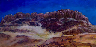
I've finished the larger painting of the night scene at Horsethief Butte in the Columbia Gorge. I followed the same process I used for the study, except I did use the projector for the drawing. I had already applied a textured gesso layer to the canvas before I glazed the study and decided it was too much, so I went over it with a second layer of gesso with a scraper, which covered up a lot of the texture, but there's still some of the effect, particularly on the bottom. I'll be playing with it more in the future, but maybe not on landscapes so much. I first painted this one in daylight colors, then turned the lights off with overpainting. That may be the slowest possible way to get a night scene but it really makes a realistic night effect.

It took me a long time to get the colors and values right. The problem with night scenes is, if it's too light, it doesn't look like night, and if it's too dark, then you can't see it when it's hung! I had thought the commission-er was going to be hanging it in a brightly-lit room, so when he told me it was going into their living room, I decided to take it over there and try it in their room light before I glazed it. After some last minute touchups the night before, I decided I was finally happy with it. Fortunately, he was very happy with how it looked in their living room, so I've got it back and am glazing it now.

I made a lot of use of thin color washes—phtalo blue, deep violet, and burnt orange, plus black where I needed it. Maybe someday I'll learn to mix every brushful the right color to begin with, but I do like how layering the washes creates a sort of ambiguous patina that looks like all those colors at the same time, with a kind of a elusive shimmer due to the variations of intensity of every brushstroke. It's easy to do if you give each wash sufficient time to dry (at least a few hours) so there's a minimum of lifting of the previous wash. I did do one wash way too dark, and ended up having to lift most of it off with water and paper towels. That was no fun, scolding myself while I dabbed with crossed fingers.

There are a lot of small textures in this one and I got more practice of working with the brush in one hand and a tissue in the other, ready to dab off any extra paint. I used the same technique as on the first Horsethief painting to get the effect of the sharp-edged basalt rocks—handling the different layers with different brushes and colors.

I've got too many good gorge photos to stop now, so I'm getting ready to start another one—this time of Wankers' Column in Catherine Creek State Park. Not going to do a study, just going to jump right into it.