Last week after I stopped working on the river painting in my last post, I pulled out 4 pieces of paper to try some new color schemes. But I was really tired of trying to make finished paintings out of what should be just a quick exercise (although nothing is very quick if I'm doing it) so I kept thinking of some things Robert Burridge says: "If it's boring you, turn left and keep going," and "Don't give up! At what point did this painting become a bad idea?" I used a half-inch brush and picked 4 different color sets, and had fun just slapping the paint on the paper to make 3 different landscapes and one bird shape. They were all extremely simple in this first pass, but it
really felt good for a change just to
play. Obviously I haven't been doing that enough.
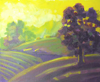 |
| Green Hills |
After they all dried, I picked up one of the landscapes and the bird
and started developing them. The landscape was another split
complementary—red-violet for the main color and yellow and green for the
complements. I chose to make the red-violet the dark color this time,
with the green for the background and yellow for the sky. When I first
brushed them in, I was astounded at the aerial perspective I'd gotten,
even with the almost pure colors. The yellow went to the background as I
wanted it to. I've had really mixed results with yellow depending on
what colors it's with—sometimes it really wants to come forward. As far
as its temperature, it really is midway between the hottest and
coolest—red-orange and blue-green—perhaps that explains why it can go
either way. Anyway, as I worked on the painting I feathered the green
and yellow forward into the hills, and took the red-violet softly toward
the distance. I added one more color, yellow ochre—after all, it is a
yellow—which makes a nice, more neutral accent. This is really the first
value study I've ever done.
I've heard lots of people say how instructive it is to paint with a limited palette, but they always choose colors they can mix to get a full spectrum. This is using only 4 colors, but the color combination is anything but full spectrum. And yet it looks rich, full, balancing cool and warm. I don't want to use the word
mood to describe the effect; I'd rather say it has a distinct
flavor. I guess
tone might mean the same thing, but it's too bland and too much like
mood.
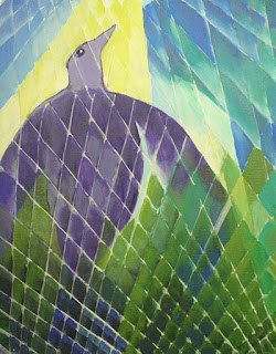 |
| Bird Spirit Rising |
The bird has an analogous color scheme, running from violet through yellow, over half of the color wheel. The yellow adds just a bit of warmth to the fundamentally cool combination. I love blues and greens and violets. (Saving this for the web has shifted the violets on the bird to be a lot more neutral gray.) When I looked at the first pass of the design, I knew it was far too simple, and I didn't want to end up painting feathers. I added the different grid patterns on a whim—after remembering that I'm just playing here. I'm a big fan of several of the early modern painters who interwove their main designs with random patterns to make them more interesting. Even though I think of it as a gimmick, I think it works for this sketch, and it was fun doing it.
I pulled one more trick to take some of the drudgery out of my work—I skipped gessoing any more sheets of watercolor paper and used sheets from a Fredrix canvas pad. I don't really care about the canvas texture, but they stayed much flatter than the gessoed 140 lb. paper. I liked them so much I picked up 3 more pads at the Blick store sale! I've almost forgiven Blick for murdering my Art Media store in Clackamas. Not quite, but almost.


really very nice work on both of the pieces. I admire your color work and how you are trying different color wheel ideas. Lovely glow of light in the landscape one and I think the geometric painting of the bird and the colors are so unique...keep on working this way. You really are creating wonderful new work.
ReplyDeleteThank you so much, Jackie! I always appreciate your feedback. I sure never thought I'd be painting a yellow sky! Thanks for the encouragement. -Patty
ReplyDelete