Showing posts with label sketching. Show all posts

Friday, May 5, 2017

Exploring more orange "chords", with purples this time

Mountain Ranges
I wanted to get more experience with all the wide variety of oranges available, from yellow-orange to red-orange, and wanted to pair them with purples in a new bunch of sketches. I also wanted to play with more ideas for abstracts. This idea I had fun with a couple years ago with Volcano Country; I've always loved living around mountains, and much of my time in the western US has been with some visible from my home.

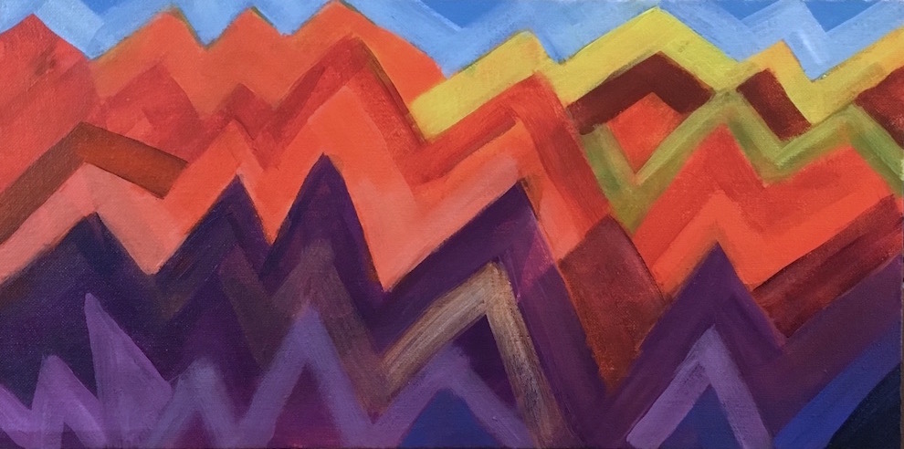
Orange and the violet used in this sketch are two thirds of a triad. For this one I threw in some single-color accents of yellow, yellow-green, and blue, just to see how they went together. Yellow-green and blue are half of a tetrad with orange (and red-violet, missing here.) I subscribe to the idea that color combinations are completely analagous to chords in music, and that you can get a lot more interesting  art when you use more complicated harmonies. Sometimes what you leave out is as important to the feeling as what you put in. But whether or not any combination actually works in a painting depends on placement in relation to the other colors, relative size, saturation, and how it supports both the subject and the idea of the painting. Only seeing and feeling it can tell you if you've hit the mark—you have to play to learn.

I think if I moved these colors around in the painting I could get several different moods, as I could if I used different values. It's a mix that carries a lot of energy and seems to beg a lot of "why?" questions, which really stimulates my imagination. Orange suggests earth and sex; violet points to spirit and the higher mind. Orange feels grounded and practical; violet leans toward infinite space and unbounded imagination.

One thing for sure—I'm never going to get tired of color.

Wednesday, April 19, 2017

Morning sun and shadows in a canyon

Canyon Shadows
Yesterday after I finished the last sketch I drew this one onto another 8x10 canvas sheet. I put about 5 micrograms of paint on the bluff tops in the wrong shade of yellow green and said, anhhh, tomorrow. Restarted after lunch today, knowing it had to be more citron-ish. Went through several shades of gray before I got a good general representation of the basalt cliffs, tricky because of the late morning light and blue-sky shadows, and ended up having to wash them all with ultramarine and black before I got the value right. I also had to stand back about 12 feet when comparing it to the photo, in order not to get lost in the detail.

I had a background goal to try to finish this as quickly as I could as a sketch. My watercolor friend says she likes to finish in one or two hours, so I set a goal of two hours, but it took me three and a half to get it to this point, not counting a fifteen minute walk through the garden in the middle.

This one didn't put up much of a fight, but I really didn't set the bar very high—I wanted it loose and I was much more interested in figuring out the colors than in focusing on detail. This is based on the idea that if you get the right colors in the right places, it's going to look pretty much like your subject, and "pretty much" was right what I was aiming for.

I really want to do this one bigger at some point—it's one of my favorite shots from my trip—but I wasn't sure I could handle the detail. It wasn't a problem at 8x10 size, but it'll be a different story at 18x24 or bigger.

So I'll do more sketches first.

Tuesday, April 18, 2017

Blue & yellow color study sketch


After my experience with blues and yellows not wanting to work together on the daffodils, I thought I'd try a couple color sketches, just to play with them. I wanted to find a color combination that did look attractive to me.

For this first one I used another photo of Catherine Creek I wanted to try, and pthalo blue on land, ultramarine and a bit of dioxazine purple on the river, diarylide yellow in the sky, and diarylide plus primary yellow on the far hills. As soon as I added a couple tints of the blue, it looked like a late evening in winter, which was a surprise, and I was surprised to see how almost realistic the colors look.


I thought the colors looked great together here, so maybe it was the higher proportion of yellow in the daffodils.


In theory, this should have needed some red or red-orange to balance the blues, but I guess the Diarylide, a yellow-orange, adds enough balance to keep it from looking one-sided.You never know what you're going to find out when you start playing. In this case, I found an interestingly pseudo-realistic color treatment.


I spent a couple days last week exploring this same part of the Gorge with friends, and got a lot more photos to work with. I'll be quick-sketching a few of them. Don't know if I'll try any more snow scenes now; maybe in August.
😊

Saturday, April 8, 2017

Progress of skills is not linear


I never thought a two-day sketch of daffodils could be so hard to paint. It was interesting the first day, frustrating the second, really frustrating the third, and after the fourth I was ready to give up. But on the fifth it finally started looking a bit better, and today, it's okay. What took the longest was nailing down the basic colors. I've never done much work with whites except clouds. Lavender was the first tint I tried for the un-highlighted areas on the white petals, and that wasn't awful but it wasn't pretty. Then I tried gray-greens, and blues—I've always loved blues and yellow together, but not this time—before finally settling on an almost teal, which went well with both the yellows and the greens.

The other big problem was that the photo reference was strongly backlit, and I couldn't make that work in two days of trying so I gave up and faked more normal lighting. Once I got that far, it finally got to be fun. Now that I'm ready to call it done I'm thinking how I could have done it better—but that's a major point of sketching—get the first one out of the way, and stop thinking about it. Just get the experience under your belt.

But I did really get a good education in yellows and ruffled edges, and I only rarely work in yellow or orange. I invoked the artist's privilege to outline the coronas in purple; that was anti-realistic and fun. Sometimes I just want to find out what I can get away with—it's good practice drawing with the brush, and 100% approved for sketching. That's still how my mind works, unfortunately—Is this okay? Is it allowed? I sure hope I can get to a point where I can stop worrying about that. The only things that matter are how the painting looks, and what lessons did I get from this one?

Saturday, March 25, 2017

Looking East

Looking East
I was actually afraid last night and this morning that I wouldn't be able to do another gorge sketch today. But I started the same way and used the same strokes, and they really look a lot alike. I learned something new, though—that with the Blick Professional Gesso I can scrub paint off with a wet brush  when I make a mistake and get almost all of it off without visible harm to the gesso. That's very handy. I first drew the rock outcropping at the wrong angle, and was able to fix it.

I did more work on the foreground in this one, wanting to see more of the grasses and do more to balance the foreground and background. I also mixed a lighter color for the distant bluffs.

Friday, March 24, 2017

Sketching the Gorge with a very used brush

Rowena Plateau
I decided it's time to start working from some of my photos of the landscapes around Catherine Creek State Park, east of White Salmon, WA, on the Columbia River. I sifted through them yesterday and grabbed a couple to start with. I was ready to start a canvas panel this morning when my muse whispered, "Do sketches." I spent the last two days doing color experiments so I was already in "quick" mode.

I mixed up a nice china blue from Pthalo blue and Dioxazine purple, and picked up a superbly beat-up and damaged small flat brush and started scribbling in the dark shapes. The bristles on one side are bent back 360ΒΊ and they were great for scratching on trees, branches and other rough shapes, while the other side was still straight enough to sort of draw lines and put the paint on flatly. I did use a different tint on the river, a mix of Pthalo and Cobalt blue. I was going to color it in fully, but decided to stop with a value study.

I'm surprised how traditionally "sketchy" it looks, and yet how fresh and "real", as if I'd done it right there. It seems like a great example of brush-stroke texture as detail, and I'm liking how many different looks I got depending on the value and thick-or-thinness of the paint and how much time I spent on that bit. No real painter would ever throw a brush away, unless maybe the handle breaks off, and clearly this is why. What a gold mine!

Friday, February 24, 2017

Finding out what you don't know

Floral 8
Finding out stuff you don't know is a great reason to do sketches. It also feels like a whack in the shins because there's a good chance you're going to get something you're not going to like. The goal of creating a painting you like evolves into the goal of finding out what you need to work on before you can accomplish the previous goal.

I found out I have a very incorrect image of daylily blooms in my head. I see a couple hundred daylily blooms every year in my garden, but the only way I ever looked at them was face on. No matter how much I tried to paint them from the side, I couldn't make them look real, because I had that shape completely wrong in my head. I managed to google some references online so I could finally finish it, but only after painting them all wrong a few times.

I just kept thinking, if I really understood the structure of this flower, I could paint it much more quickly with many fewer strokes, and it would look more alive.

So, this year, to become a better painter of flowers, I'm going to be cutting more flowers, bringing them inside and taking photos of them from different angles, and sketching them until I have all those  shapes in my head, ready to use any time.


Tuesday, February 21, 2017

Lessons from the imagination


This was another interesting journey into the unknown. My intent was a loose floral sketch in a new color scheme with a dark background, and to start without drawing, make color blobs and see what developed. I started with mahogany—blackened red—for the dark upper background and instead of the complement of green, I chose a split complement of yellow-green and blue-green. When I went looking for other colors for accents, I added yellow-orange and a grayed blue-violet to complete the harmony.

As much as I was enjoying the way the colors played together, it chafed me that I had chosen such an unrealistic color for the flowers. There are many kinds of green flowers, but none like these. But instead of restarting I chose to stay with it and see if I could make another interesting composition out of it, as an experiment, to prove to myself that reality is not necessary to make an eye-catching painting.

In my last painting it seemed that a contrasty light-dark composition was what attracted my eye most strongly, and I wanted to test that in a different set of colors. Whenever I got stuck wondering what I wanted from this painting, I knew it would have been easier and quicker to copy an image I already had. Because I couldn't do that here, I had to let my imagination guide me. But, if you want to grow a muscle, the best way is to use it, so I chose to paint what did come out, and it was these giant mutant primulas.

The hardest part on this one was creating the light-dark pattern from my imagination—I don't seem to have any facility for that at this point, and that's one of my big motivators to do all these sketches. I went through several stages of moving the light areas around, shrinking them and growing them. When there was too much light, the painting lost its center and looked like a less interesting piece of a larger painting. I had to surround the flowers with dark in order to keep them inside the frame.

I also wanted to play with outlining, as that seemed another way to draw attention to particular elements of a painting, to be a substitute for detail. I can tell that it definitely works for that, just as shadows do. But here, it was really too much until I strengthened the lines on all the stems, and outlined the orange flowers in a less dramatic color.

This is why I'm sketching—to learn all these lessons. Now I have more ideas to play with as I'm working out my next compositions.

Tuesday, February 14, 2017

Get your scribble on

Floral 6
This is starting to feel like a whole new ball game. I started with color blobs again, yellow, blue, and red, aiming for an off-center floral with a lighter background. My goal was to get a more open bouquet with fewer, more interestingly-arranged flowers, not the symmetrical bundles I seem to be locked into, and to attempt a glass vase, all very loose and energetic.

While I was working up the background, I rediscovered the joy of scribbling. Some people are doodlers, but I was never a doodler, I was always a scribbler. Sometimes I think I'd be perfectly happy just piling one layer of color over another, completely covering the one before, just scribbling with the brush, but I've never believed that that would actually produce anything one would call Art. Maybe I'll try it someday, but in the meantime, I did find it very satisfying to abandon all discipline and just scribble the background in.

When I started painting the flower blobs, I still couldn't stop myself from painting a big round bundle that looked heavy and solid, and had no air in it at all. So I left it to dry and came back later with the light blue background and painted out about a third of the flowers, and that improved it greatly. But I didn't like the pale yellow and peach in the background and table so I darkened them to where they are now and worked up the vase. When I stopped at that point last night, it was clearly the best floral I'd done so far, but it still looked like it had a little headache or ate too much the night before—just a little off color.

I didn't figure out what the problem was till I'd looked at it on the computer. I had used a pthalo blue in the top background, and cobalt on the flowers. I decided to try switching the pthalo to a cobalt wash, and bingo! That was the problem. I've combined those two colors in a lot of paintings and they've worked well together, but they really didn't in this mix, at least not the way I was using them. I also darkened the tone of the top blue, which popped out the flowers more.

Saturday, February 11, 2017

From color blobs to abstract

Landscape
This time, I did begin by painting color blobs. I started with greens and only expanded to yellow and pthalo blue, plus black for the fern greens. I started out with a lighter blob at a typical center of interest point and then surrounded it with darker blobs. I built outward from the center till the paper was covered, then added the rectangular blocks. At that point I felt like I liked the composition, the light and dark patterns, and was really happy with the colors.

I also thought it reminded me of an aerial view of a complex of buildings in a green landscape. Today I decided I just wanted to clean up the edges, overlaying lighter or darker colors to please myself. I drew the few lines to support the idea of structures, and to draw the eye toward that left yellowish block. I'm trying to remember to only put detail around the intended center of interest.

At last—an abstract sketch! From color blobs! With a design I like, which was my goal.

Wednesday, February 8, 2017

A different canyon, a very different experience


I wanted to paint this canyon as soon as I saw it; it seemed like the archetype of a high desert canyon. I picked it for my second try at Zion and was hoping for another short and easy sketch, but by the time I had five hours on it and it still didn't look anything like I wanted it to, it obviously wasn't either.

I decided it must be a problem-solving session for painting rock formations, and that's something I want to learn to do, so I just kept working on it. The big question in my mind was, how much detail should I put in? I guessed the answer is, however much as pleases me. I had to try to find a balance between the endless textures in the photo and the minimum amount required to make not a quick sketch, but a painting. It lacked the strongly delineated shapes of the last sketch, so it seemed that I would have no choice but to work on the surface textures of the walls. I put in what seemed like a medium level of shapes, feeling like I should concentrate the detail around the canyon opening. After that I spent quite a while first figuring out the colors, and then contouring the shapes. I left two areas without any detail just to see how they would compare with the rest, and I decided that was not enough detail.

There was one area I just couldn't get to work with the other sections, and I stared at it for a day without getting any ideas. But the next morning I woke up knowing I was ready to gamble that something good would happen if I just kept working on it. So the first thing I did that day was cover the whole area that didn't work with a wash of dark red. Immediately it not only fixed the problem, it completed a larger pattern of blocks of color that I hadn't really noticed beneath all the textures. It occurred to me that the design of this painting, rather than being lines, was the shape of those color blocks.


A couple of the sketches I've done lately have had more interesting compostions that I had in mind when I started them, so I've spent some time studying them. I'm going to try and keep track of the ones that I like.

Tuesday, January 31, 2017

Sketch painting for practice

Zion Sketch 1
Once again with a full palette after the two florals, I decided yesterday it was time to tackle some of the 1" thick stack of my photos that I've thought about trying to paint, and picked one from Zion National Park. I wanted to do as quick a sketch as I could, just enough to work out if the image would translate to a painting both composition- and color-wise, plus be as interesting as I thought it was as a photo. I already had the colors I needed on the palette, so I grabbed a scraggly brush and started brushing in the shapes, and filling them in with what I already had mixed. Since there were a lot of dark and shadowy areas, I brushed those in as well to locate all the shrubbery and rock contours.

I loosely followed the colors from the photo, inadvertently intensifying them. This composition seems to play the light orange off the fairly-pure yellow of the central tree, but with plenty of support from blue, greens, and the grayed violet. So once again, the same basic combination—yellow & violet, and orange & blue, but this time with a lot more of the yellow-greens. I really can't believe how versatile this set of colors is.

I was thinking as I started that doing sketches would give me both a lot of practice, and a low-pressure place to figure out how to handle the more challenging areas, which in this case were the shadows, the large rock mass behind the front one, and the tree in the foreground. The rock mass I had to repaint a few times, and it took a few tries to get the hue and value of the shadowy areas on the orange rock, but the yellowish tree in front was a lucky break. I like the way the simple shape and bright colors attract attention to the foreground while they're playing off the more distant orange. I had thought I would want to refine the whole painting more, but was happy to find it had a lively rough look that suited it.

I see lots more sketching in my future.