Showing posts with label shialavati. Show all posts

Tuesday, June 11, 2024

Chasing Monet

Haystack Rock
12"x12", oils on canvas

 I was looking for some new ideas for landscapes and also wanting to do some work with water, I decided to do some of the Oregon coast. I happened on a news article on Monet's water lilies and procured a used copy of "Monet Water Lilies - the Complete Series" by Rey and Rouart. I drooled over it for two days straight, trying to absorb the meticulous looseness, the freedom of not-necessarily-realistic colors, and the magic of the water's surface, the reflections and ripples. He was one of the first painters I studied and he's always been an inspiration to me.
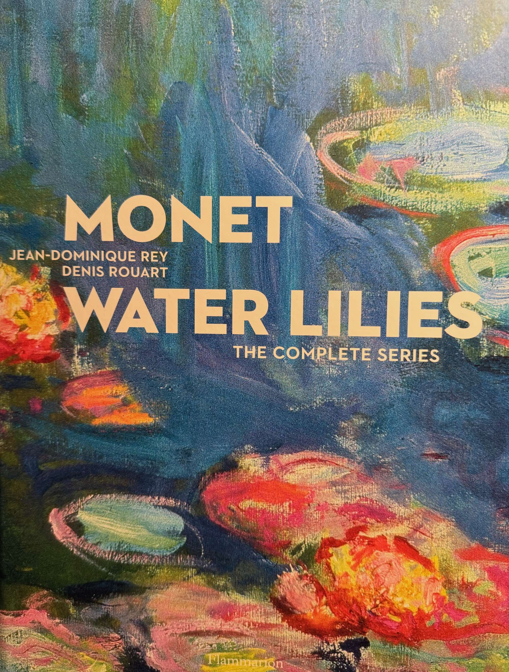


Getting this book means I can stare at the lilies as much as I have time for—it's unlikely I'll ever make it to France! Sometimes parts of a painting look clean and spare, with just a few colors, or very similar pastels that relax the eyes and and the mind. Other times, in dark areas, it looks almost brutal, heavily overloaded strokes of colors that don't seem to make sense, but still convey deep mysterious darkness, lifting up the lighter areas and maximizing their impact. I feel like he's using color as a structural material, and I get the impression that he didn't have any qualms at all about using whatever colors he wanted to, whether his eyes could actually "see" them in the subject or not.

I wanted to paint Haystack Rock in as impressionistic a style as I could manage; by that I mean I wanted it to be loosely done, with vibrant, engaging color and simplicity of shapes, using texture and light to evoke a sense of presence. It seemed to me that his approach on the lilies was to lay in the water first with unstructured strokes, mixing many hues of blues, greens, lavenders, and then more-or-less draw in the flowers and lily pads with dry-brushwork, layering strokes until he got the depth and mix of colors he wanted. He doesn't bother with small details, letting one stroke suffice wherever possible, implying rather than stating, which in his hands conveys not just the water and plants, but a three-dimensional space and the feeling of looking at the subject as if you were standing next to him.

Another modern who impresses me in the same way is Sargent; his economy of strokes really amazes me, and it's a skill I really aspire to. I've heard over and over that suggesting the subject and surroundings engages the mind of the viewer more than explicit detail does, and enhances their sensation of the painting; I believe that is the the way vision works--you can take in a whole scene or you can focus in on one thing at a time.

Now that this one's finished, I'm starting another Haystack Rock, so I can explore other color palettes and more water formations, hoping to get closer to that magic that Monet was such a master of.

Thursday, May 30, 2024

Lessons from a risky subject


The King

Finally put the last touches and a coat of retouching varnish on Smokey's portrait. I was really happy to finish and get ready for something different. The practice I got painting the fur was invaluable, also working out the colors for the fabric, and getting the "old paint" look in the background.

I've started work on a new small seascape and I can tell that I learned a lot on The King in handling the paint and understanding how I want the painting to look when I'm done. This reinforces my belief that the only way to get good at anything is to do it, as much as you can, as often as you can, and to explore every aspect of it that interests you. I've read plenty of books and watched videos, and I've learned many things from them, but until I pick up a brush and try something, it doesn't—it can't—make any difference in my work.

Sometimes a difference in the type of brush, or how you're holding it, or the consistency of the paint, or if you're using a medium or not, can make a huge difference in your results. The risks you're willing to take, trying a new approach or a subject you have no experience with, can open up new opportunities you'd never thought of.

But whatever you do, keep painting!

Thursday, March 28, 2024

WOW!!--Lavender oil as a medium!!

The King (detail)

While I was working on my last finished painting I happened on some web articles about how some old Dutch Masters had used "Spike Lavender Oil" as a medium, and not really being all that happy with the 50/50 stand and walnut oil mix I was trying—it dried more quickly than walnut but usually took 2 days on thin-to-normal paint—I ordered some spike lavender oil and used it a little as I finished that one up. Then I started an 18x36" portrait of our Lynx Point Siamese cat Smokey (I wanted to figure out if I can actually paint fur, and practice my 'fine lines') and have been using the lavender oil exclusively. Wow!--the only pigment that does NOT dry overnight is white—all the other colors are dry to the touch and ready to paint over the next day! With that change, I found I've returned to my long-time habit of working in layers, building up color and implied texture in layers, fine-tuning the blend I want and making use of the translucency of most colors. The photo shows the closest-to-finished area of the painting so far.

The oil dries flat and matte, and is as clear as any other oil medium I've used but has a very faint tint, so it might start showing if  you end up with a thick pile on the canvas, but so far I haven't noticed. It's quite thin as oils go, so it's great for thin glazes or washes. I keep the large bottle next to my palette and use the long dropper that came with it—eazy peazy. Although I'm a fan of lavender in general, I DO recommend very good ventilation, and/or a fan behind you blowing it away from you. I use a fan and an air filter to minimize it, but it is one of the safest essential oils you can find and it's non-toxic and non-flammable, which take it to the top of my list! But if you don't care for the smell of lavender, wait till someone figures out how to deodorize it—without ruining it for painting in the process.

I can rub dry paint off with a paper towel some, so I'm thinking I may finish up the top layers with stand oil—or another mix. But it's fantastic for the way I approach painting—giving myself plenty of freedom to rework areas till they look like I want them to--without a bunch of uneven or unwanted build-up.

As for my fur renderings, it's not quite what I want, I'll probably keep experimenting with it, but it does look enough like fur to not be freaking me out. The fine line technique I wrote about last time is promising for fur. There are so many different tints and shades in his coat that layering is the only way I can think of to reproduce them. I'm not quite half-done, and it'll probably take me another month to complete it. I'll be back with more photos then!

Saturday, December 9, 2023

Painting thin lines the easy way

Close to the Earth, © 2023 PM Arnold
20x20", Oil on gallery canvas

I took the photo of this Rabbit Brush shrub in 2002 on a trip up Hwy 395 to Mammoth Mountain from Ventura County in November. There was fresh snow on the Sierras and the leaves had turned orange and rich red-browns on all the willows and brush in the dry washes that ran from the foothills down into the Owens Valley. I rediscovered it looking through my old photos this fall and decided it was time to try painting it. I had had some practice painting skinny twigs and thought I might be successful this time, but was still very surprised at how well it went.

I've never had much luck painting thin lines with small round brushes, and especially now that my hands shake more than they used to. But what I have found that works is a 3/8-to-1/2" bright brush, synthetic or fine hair, using the long edge and touching it as lightly to the canvas as I can. The paint has to be liquid enough to flow off the brush, and if I make a blob or the line is too thick I swoop in immediately with a clean brush to pick up the extra. The other attribute of a brush this size is that it will hold a fair bit of paint, and it's not too hard to get a nice long line before you run out of paint. Only new or un-frayed narrow-edged brushes will work, and I try to keep a newish one on hand just for this purpose. Once I cover an area with lines I'll usually let them dry before I paint on top them; once I get good ones down, I don't want to risk messing them up.

In the photo, the sand & dirt was covered with a layer of tiny gravel, but I decided that was more texture than the painting needed, and just shaded in the varied grays and tans without offering much detail. Painting the live and dead branches took the most time, as I was trying to capture their varied colors and "bundle" appearance.

Sunday, November 5, 2023

Is this what inspiration feels like?

Sunny Afternoon at Horsethief Butte ©2023

I was looking through all my Gorge photos and found a pretty dull shot of a streak-clouded sun above the landscape that really grabbed me. Staring at it, something in my mind spent a few seconds pointing out what I could do with its obvious challenges, and briefly I magically visualized what I wanted it to look like. Putting aside the other candidates I had pulled out, I used iPhoto to get more detail in the foreground rocks, and went to work. I roughed in the sky and sun first, realized that it looked exactly like I wanted it to, then worked my way down, pretty evenly, till it was finished. I'm sure that having pre-visualized the whole thing resulted in a better outcome than I'm used to having.

Since that approach to choosing my next subject had worked so well, I decided to try it again. I went through the large collection of candidates but nothing would talk to me. I looked back at my old photo files to trips in California, and came across a pair of subjects I'd thought about doing for years. These were taken on US 395, a winter trip to Mammoth Mountain, on the dry side of the Sierras with the mountains on one side and the high desert of the Owens Valley on the other. I had the same experience with them, of quickly going through the way I wanted to paint each one, the major steps to make it interesting.

I'm glad that my mind is finally catching on to the idea that I don't want to just copy a photo, I want to use it as a reference for a more introspective painting, with some particular feel, or emotion to it. It's rare that I take a photo that would be perfect without any changes, so being skilled enough to handle adapting it to catch people's attention would be a big step up for me. And another issue--a trap I'd like to not fall into any more is literally copying a photo because I love the subject and then finding out it makes a confusing, unfocused painting. I've done that more times than I want to think about it.

So if I can add this mental process to help me screen my photos for winners, that will be great! No more boring paintings!

Monday, April 3, 2023

Recovering the Joy of Oil Paints

Catnap


A few weeks ago, a friend gifted me with a full set of Oil Paints that her son no longer wanted, and got me painting with them again! I had switched to acrylics because in the predominantly wet weather here in Beavercreek, they were taking more than a week to dry. This was before Alkyd paints were popular, and I'd had enough of water-miscible oils that I wasn't going to mess with that any more. But a few years ago I got a heat pump, and it keeps the humidity inside low enough that they dry in about half the time they used to. And I'd been thinking about wanting to get back into them since last fall, but was dissuaded by the cost of buying a good big set.

So I picked up some turpenoid products and spent a couple hours watching The Paint Coach on YouTube, and started my first painting. I picked the most complicated composition I'd ever tried, which was a mistake, and it took me almost 4 weeks to get it to an acceptable state, but I'm working on a second one that should be a lot more fun and relaxed. I'm wanting to play with them more, try out some new techniques, and just relish the gooiness and pleasures of oils.

One thing I've really missed with acrylics is the possibilities of brushstrokes! It's really fun to use brushstroke to mimic actual texture in the subject, or to add structure to the painting as a whole by changing how a particular part of the composition reflects the light or attracts the eye of the viewer. Think of Van Gogh's brushstrokes. Ever since I was immersed in the superb Van Gogh show and display last year, I have repeatedly enjoyed strong visual memories of how persuasive his sculptural brushstrokes are, how they attract attention and reinforce both the colors and designs he created. I wasn't able to do use brushstrokes in this painting, I was too overwhelmed by working on an intimidating combination of unfamiliar subjects—the person, the cat and the fabric--but I'm trying to use them in the painting currently on my easel—a landscape of the famous Coyote Wall in the Columbia Gorge. I'm sure it'll take me some time to get used to thinking about every single brushstroke as I load the brush and apply the paint, but it's a skill I look forward to getting good at.

One creative choice I did manage to assert in this painting was to eliminate two thirds of the stripes on this duvet. Putting them in would have added another month or two to the painting time, and given the shakiness of my hands these days, would have made it a lot more chaotic and difficult to look at.

Friday, January 20, 2023

Back to Horsethief Butte

I still have at least 100 pictures of the Columbia Gorge that I want to paint, and this time I went back to Horsethief Butte for a south view showing late afternoon light on the western part of the butte, plus the vegetation farther from the walking trail near the massive outcropping. I went with friends just before sunset and I shot many images as the sun slowly dropped behind Mt Hood and the Columbia River. Most of the grass was long gone dry, just the tiny water-hoarding groundcovers still showing any green. Gray, Tan, Ochre, and Orange were the dominant colors. Horsethief sits in the rain shadow of the northern Cascade range so it dries out mid summer to glowing golden slopes between the blue sky and the river reflecting it. It was a beautiful evening and made a lot of memories for me.

Saturday, April 23, 2022

The challenges of painting clouds with softness and subtle color variations

Catherine Creek Cloudy Day

 I was at Catherine Creek State Park with a friend one March morning a few years ago when clouds were moving across the sky, blocking and then revealing the sun. We even got drizzled on for a bit, but had a lovely 2-hour hike through the basalt bluffs and weathered towers, with spring wildflowers blooming throughout the meadows and the oak trees still bare. I did one painting soon after that of Wankers Columns, but had several other photos I wanted to paint, including this one. When I took the photo, looking into the sun, I was really happy with the shapes and density of the clouds, framed below by this small rain-shaped gully bordered by rough basalt ridges and thin stands of white oaks.

But the photos themselves were complete duds, no color whatsoever in the clouds and the landscape completely silhouetted against the brilliant sky and almost-revealed sun. I loved the composition but hated the loss of color. For the years since, I knew I didn't have the skills to recreate the scene, with the brilliant spring grass and the subtle hues of the backlit clouds. In the last year, however, I've been practicing on clouds, working to develop a technique that would give me the look I wanted. I don't know how many times you have to paint a subject before you know it well enough to create it from your imagination, but that is my goal with my subjects, like the landscape and clouds here.

Acrylics have a lot of challenges in the best of circumstances, and more for slow painters like me. I have neither the experience nor the confidence to paint a new subject boldly and quickly, before the texture of the paint becomes either too dry, or too wet from trying to keep a mixed color from drying out over a period of several days--or weeks--while I work out the details of the composition. I almost never want to use the straight tube colors--I end up blending them, adjusting the value, and mixing colors freely with both their complements and their neighbors on the color wheel--whatever I have to do to get just the colors needed to work together.

I also like to layer colors to mix them. On this painting I used more than a dozen different mixes of gray, white, black, two blues, two purples, yellow, orange, and green to get the hues I wanted. And I frequently misjudge values, even with the reference photo on my iPad for the best color, and end up having to lighten or darken whole areas after I've painted them, to get the scene right. Sometimes it feels like I've painted the whole painting three different times, slowing bringing everything into the right balance.

My latest discovery has been that once I have the basic pattern of the painting done but the colors just aren't right, and they need just small adjustments, I can tweak them by picking a very small amount of paint on the right-sized brush, then wiping the brush gently on a piece of paper towel, so there's very little paint on the brush. With that, I can put the paint onto the canvas very carefully without it globbing or running, or me leaving so much that I have to wipe it off (which is also a useful technique.)Then, of course, I have to let that bit of paint dry so I don't smear it with additional strokes. That way, I can adjust the value or hue by small amounts. And when you do finally have the value relationships right, you can get amazing depth and subtle textures of colors.

Wednesday, October 20, 2021

Big fish: How to solve the biggest problems

Do You See Me?

I recently read the book "A River Lost: Life and Death of the Columbia" by Blaine Harden and was persuaded to enter an art show about the topic of the book, which was all the engineering projects that were done to the Columbia, with their resulting human and nature costs and consequences, the small benefits and the big losses. I was moved to try to give 'voice' to the inhabitants we rarely see outside of plastic-wrapped food packages—the salmonid poopulations that are hovering on the edge of extinction due to the consequences of the slowing of the river and the consequent increase in water temperatures, exacerbated by global warming.

When we view the Columbia River, we see many different types of work and play, but unless we’re actually fishing, we usually don’t see the salmon there. They are an inextricable part of the ecosystems of the entire Columbia watershed, feeding many of the peoples and the other animals, yet they are nearly invisible to us. This painting is to give viewers an up-close and personal view of what salmon look like in the river. It is based on a photo taken by Mark Conlin and published in Hakai magazine on the web.

Forest science studies show it was the fish spawning and becoming food for land mammals that provided the nutrients for the great forests; fish that used to come upriver in groups so dense "you could walk across the river on them," a perfect and seemingly inexhaustible food supply for the entire region, and this year the run was so small that fishing had to be closed months early. I keep wondering what it will take for us to mend the damage we've caused.

There was a great special on OPB this summer about two groups who were fighting over the "owls vs. loggers" dilemma who started spending happy hours together, drinking, becoming friends, and talking about each other's viewpoint, and wouldn't you know, they worked up a solution between them for how the loggers could do their harvesting and at the same time protect the owl populations.

Right now we have separate populations arguing their needs are the greatest, the most important, and that others' needs should be set aside. Maybe what we need is to argue instead that all the interests are important, and start working on ways to cooperate to meet everyone's needs. As soon as we recognize the equal importance of all the things we want the river to do, we can stop wasting time defending our interests as "the right ones" and start working on balancing solutions that allow us to do all those things--maybe in different ways--so that all those goals are achieved.

Thursday, August 26, 2021

A new series with lots of trees and foliage


Mt Adams Early Light

Some friends asked me for paintings from three different photos they took on a July 4th camping trip, taken on different days and at different times of the day. I love Mt. Adams so I was happy to take the challenge. I took some liberties with the composition, bringing the mountain more forward (and larger) behind the middleground, and also making sure the dead branch was the same in each painting, as it was a feature for them. After taking the photos they noticed that it was always there even though the locations were different, so they asked me to put it in.

Mt Adams Sunny Day

The most interesting part for me was the difference in the lighting and how to capture that. The foliage in the sunny photo was a real test of patience, as the mix of white oaks, pine, and firs created a tapestry of greens and leaf outlines and textures. I didn't want any more detail than I needed to convey the mixed forest. I ended up blocking in the dominant color shapes before I worked on the detail. That and trying to match the subtle gradients in the sky colors took twice as long as I expect. The blues in the sunny photo were so close I literally couldn't tell if I had the right color or not as I was putting on the wet paint, and I had to wait till it dried and darkened to see if it was right. There was a very slight hue difference between the mountain and the sky, that also helped me get the colors mixed up occasionally. There was a lot of repainting on that one.

Mt Adams Sunset

The sunset picture gave me some good practice with shadow colors. As I've found before, shadow colors in the afternoon and evening are frequently warmer than one would think. All in all, it was a fantastic practice in drawing, painting the pine trees, and in color mixing. And I still love Mt. Adams.

Sunday, January 31, 2021

Learning to paint clouds

I made a commitment to try to learn how to paint clouds this winter. I'd like to get to the point where I know them well enough to be able to invent realistic looking clouds. My goal is to finish ten small cloud paintings. I've just finished my third and have started my fourth. I forgot to put the first two up here, so here they are. Both are of Spring clouds in the Columbia Gorge, looking north from the Oregon side of the Columbia River, in the vicinity of Tom McCall Preserve, west of Hood River.


It's all about the Composition


Goat Mountain Sunset

I've spent an awful lot of years learning to get the colors I want in a painting, and I'm getting good enough results now—not necessarily easily, but eventually—so it's time to get on to the next part of learning to paint: the paramount importance of composition, and how to create a good one. I take thousands of photos a year, and maybe 1% of them I recognize instantly as having a great composition. I've watched other people do value studies, and I've done some myself, but only a couple days ago, as I was contemplating what to paint next, I finally understood that it's during the value study that you adjust the composition until it acquires what it needs to attract attention. I always end up trying to fix the composition in the last third or less of the painting process, because I've been so focused the whole time on getting the colors right.

I frequently repeat the saying I read long ago, that "Painting isn't hard—you just have to get the right colors in the right places." So I was focusing on the right colors; now it's time to focus on the right placing.

I did a monotone value study for this last painting as the first stage, and I think it's been this experience that's made me fully absorb the process, and be able to think about it clearly. The study looked like this:

Then when I started painting over it, I first went with a blue violet palette, looking for something dramatic.

I decided I didn't really like that, and shifted more towards aqua hues, as I kept reworking the shapes and adding details, until I had the underpainting finalized.

And then I finished it, using a new trick to make sure I was capturing the composition that attracted me to the photo in the first place. I like to use my iPad as my color source now, but looking at an image that large (anything bigger than 5" on the short side) makes it really difficult to see the larger shapes—my brain just gets lost in the detail. So I print up a small image of the reference, no more than 4" on the long side, and tape it to the easel post right above the painting. When I stand back 8-10', I can easily compare the shapes in the painting to the shapes in the photo, and see how to fix things if I've gone wrong. Ta-da!

This view is not in the Columbia Gorge, it's from near Cornelius, at the edge of the coastal range.

Wednesday, December 2, 2020

Getting the lines right from the start

White Salmon Canyon Overlook (SOLD)

I've only been realizing the last couple paintings that I've done a poor job of the overall lines and shapes from the get-go, before I finish the painting. It never used to dawn on me till well after I'd finished glazing and framing it. This one, I figured it out in time (I hope) to partially fix them. The problem was, I had made the outlines of the yellow hills too rounded, making the composition look cutesy, and not the impressive vista I had seen. I also made the foreground slope not steep enough, but was only partly able to correct it. However, the change I made was enough to drop the cartoonish look and make it more true to my memory. I hope next time I'll make more certain of the major lines while I'm still at the drawing stage.

I've felt all along that the overlapping triangle shapes was the big attraction about this composition, along with the opposing blue darks and yellow lights, not quite a harmony but interestingly close. I'm thinking that having those lines and proportions correct is key to capturing the visual feel of a landscape--not to mention the demeanor of the whole composition—the big zigzag here is what I always think of when I see this, or remember first seeing it at sunset on a brisk fall day in the gorge.

This view is looking north up Washington Hwy 141 from White Salmon, with the river off the left side.

Thursday, April 23, 2020

The Moon In The Window


Back to doing sketches. I've gotten all wrapped up in learning how to make silver jewelry, using wire and clay, with multiple steep learning curves and lots of brain work. But Robert Burridge's facebook painting challenge made me get my brushes out again. I've had pictures of the moon through my bedroom window for years and wanted to paint it, so I started it a few days ago and made more moves on it this morning. I'd like to learn to see the minimum essential elements of an object that sufficiently define it for the viewer, but are enough to carry the mood, the feeling of it. I think you can often do that better with a rough sketch than a finished painting.

I want to do a lot more of these sketches; it's been a long time since I put in any time just playing with the paint.

Tuesday, December 17, 2019

Bromeliads

Bromeliads
This was the most interesting and challenging photo I had from Villa Catalana from last year. I've never painted gravel, or bromeliads, and I wanted to try. Once again I turned to copying a photo, because it was a splendid photo, of truly splendid bromeliads in a beautiful environment. I have not yet gotten good at the art of making up paintings out of my head, there are too many things I want to paint that I don't know how to.

I believe it's the colors that I like most about all these plants, and about the painting.

I've been thinking I need to go on a painting binge again, so today I went through part of my backlog of photos and made a point of picking out the ones that I had a feeling about, mostly the feeling that I had when I took them. Not all of them seem like ideal candidates; some are very simple in composition. I want to see if I can put in any of the magic of place I felt in those locations, and make them come alive.

Thursday, May 16, 2019

Tackling a weakness head-on


I figure the only way to get good at painting flowers is to paint a lot of them, and this year is the perfect year for it!

My wildflower expert friends had been saying how many more flowers there were in the Columbia Gorge this year, more than any year they could remember. I got a chance to join them last month and we hiked two days to see the yellow flowered Balsamroot that covered many hills in bright yellow. We were lucky enough to get those great Gorge spring skies as well (not showing in this painting) and I got lots of photos I want to paint. This one was my favorite, and after a warmup sketch of another photo, I jumped into work on it.

There was so much of this one color of lighter yellow-green that I started by painting it over the entire canvas panel. Then I roughed in the yellows, followed by the darks in the top trees and beneath the large clump in the lower right sweet spot. That anchored everything important and from there I struggled with the flowers (hard) and the leaves (much harder, trying to get the values right.)

Friday, April 5, 2019

Sometimes you have to paint detail, darn it


I want to paint loosely; I don't want to paint details. But when it comes to flowers, I feel like I need to paint some level of detail—more than I want—because I haven't painted enough of them to know how to capture their form in a loose fashion. The last thing I wanted to do was try to make this look photographic, and I'm happy it doesn't, but I am trying to paint flowers that are detailed enough to be recognizable, because I'm a gardener and a plant lover. (For you other gardeners, there are alstromerias, astrantias, barberry, corydalis, and one allium.)

What I did here was put in the background foliage first, getting both the shape and the overall dark-light and color pattern of the gentle curves down before I even thought about where the flowers would go. I felt like the background established the structure, and that structure was really the most important element of the painting. I still remember this planting as incredibly dense, dozens of different plants crammed together and foliage so thick you couldn't poke a stick through it, and I wanted to get that overabundance in the painting.

When it came to painting the flowers, I quickly discovered that my reference photo wasn't sharp enough to be able to make out the separate flowers in the big clumps of alstromerias, and in the end I didn't even try. I settled for working up only the bottom two clumps as realistically as I could, and capturing just a rough color pattern of the rest of the alstromerias.

The purple astrantias were just as difficult because they're so textured, such fuzzy little puffballs, in all shades of dark red violet to near-white. Again, if I wanted them to be identifiable, I had to make them somewhat detailed.

The lesson for me was, the first time you paint something, it's very much a learning process. I wasn't painting the flowers so much as trying to figure out how to paint the flowers, and this painting is the result.

Saturday, February 23, 2019

Hang around with creative people


I've had the glass rings and most of the copper pieces in this mobile sitting on separate shelves in my studio for three years. Every few months I would pick up the rings and chastise myself for never finishing it. Fast forward to two days ago when I was at a garden meeting talking with several friends who all do creative work or hobbies—sculpture, glass, painting, and garden design, and I mentioned to a new friend who is multi-talented that I was getting back into glass and metal work. The next day I was in the middle of working on my current painting when I suddenly started seeing mental images of the rings and some of the copper finally assembled into a mobile. After the third one I stopped trying to paint and pulled out all the elements and started arranging them in different ways, and Shazam! I have a new mobile! (And it feels so good to finally finish it!)

Wednesday, January 30, 2019

Recreating the light of late evening


Last year's paintout at Villa Catalana Cellars was a really spectacularly lovely evening, despite the presence of too many yellowjackets (fortunately they weren't interested in the food I'd brought to eat),  and as the last light was waning I got a photo from the house patio. It didn't begin to capture the colors my eyes saw in the sunset though, so when I got ready to finish it in the studio, I made myself two references—a dark one that showed the colors and values of the clouds and sky, and a much lighter one so I could see all the foliage and pond details that came out black in the dark image.

Since I usually work from photos in the studio, this happens to me all the time—getting a photo that shows my composition but not what my eyes were really able to see. This is the first time I've ever used two photos, and it really helped me a lot. I really wanted the dark shapes to be somewhat differentiated, to recreate the sensation of being just able to make out things in the dim light. The only really tricky parts were finding the right values for the white tiles on the pagoda roof, and the hanging lights there and on the pavilion. I settle on a muted brownish-orange for the hanging lights.

Friday, January 18, 2019

Painting a loss


I was in the middle of working on a landscape painting when my brother called to say that our mom, whom I'd just spent a few days visiting in hospice, had passed. Just a week shy of 94 years old, her body had been almost completely disabled by a massive stroke. Later that day as I was standing in front of the canvas again, I wondered what it would look like to see a person's life energy leaving the body and going back to the timelessness of the quantum vacuum, as it's now called. Instantly I saw this beautiful image in my mind, and really wanted to paint it, as symbolic of Mom.

Now I remember those first days after her passing as full of thoughts of her long and purposeful life, our family, and the love between us, not of the pain of her loss. The hours I spent working on it were actually happy—like I was being imprinted with the true nature and beauty of Life, instead of the sadness of physical loss. It became a permanent memory of her, from the point of view of that unknowable, non-physical part of us. When I look back on those first days after she passed, they're full of love, not of pain. I'm very thankful for that.