Showing posts with label color scheme. Show all posts

Friday, March 9, 2018

Painting rocks and pushing colors beyond the "real"

Horsethief Butte
Hiking around Horsethief Butte last fall with friends, I got a great photo that I hoped to make into a painting. These massive basalt formations are on the Washington side of the Columbia River just northeast of The Dalles, next to the Columbia Hills Historical State Park, which is also a worthy destination for the collection of Native American pictographs and petroglyphs there.

The interesting thing about these formations—and all the other exposed basalt bluffs and cliffs around them—is that from a distance, like across the lake from them, they look BLACK. But the closer you get to them the more colors you see in the stone and the lichens that grow on them—reds, browns, ochre, yellow, even green. Before I started painting I studied every photo I'd taken that day, then googled for images of basalt, and finally decided I wanted to show both how black they can look, and how colorful. That meant I had to invent my own colors, which is always more complicated, but also more fun.

I really wanted to paint the formations as accurately as possible, so I used my digital projector to draw in the outlines, and the first painting I did was to establish the angular vertical shapes of the stone in both buttes with a color value underpainting. After the initial blocking in I ended up adding multiple layers of thin washes, including violet, gray, burnt orange, brown, and black, lightening and darkening alternately until it finally looked good to me. By far, the most difficult part was getting the highlights on the left butte to look right. It took me three days to finally hit on just the right hue and value of grayed red-ochre.

The bottom line is that I kept trying different things, and if I liked it, I left it, and if I didn't, I painted something else over it. I particularly appreciate how easy this is to do in acrylics. You don't have to use medium, although you can, and I used to—now I just thin the colors with water. It's taken me a couple years to learn (and remember) what you'll get with all different dilutions of washes, from barely visible to barely transparent. I do give them at least a full day, preferably more, to cure before I put on the gel medium isolation coat and protective layer, and when I brush that on, I do it with a very soft brush and very carefully.

Saturday, May 13, 2017

Orange with yellow and green

Orange Border
I've been working on three of these 8x16 panels at once, having had three different ideas at the same time. Two of them took several sessions to finish, this imaginary floral and the one I'm posting next time. After making Chili Drawer so dark (somewhat unintentionally), I wanted to explore some higher value oranges. BTW, yesterday as soon as I picked up my brush to paint, I realized why it had come out so dark. I have a lot of light in my studio, partly because it makes it easier for me to see the brushstrokes as I make them, and partly because the colors show up better, both on the palette and on the easel. I have a flex-arm desk lamp on each side of my easel, and got into the habit of turning so part of the light falls directly on the canvas from less than 3' away. That's a lot of light, and it's a lot brighter than anywhere else in my house. So of course when I take a painting off the easel to look at it elsewhere, it looks a whole lot darker. I rearranged the two close lamps so they don't shine on the painting, and added one more light farther back over my shoulder to make it easy to see my brushstrokes. So far it's helping.

I wanted to try a long floral example, and use the greens I'd been leaving out recently. I repainted the center several times, and didn't get it right till I put those dark maroon touches in the center top flowers, and added the pale yellow portulaca—or whatever it is—that's near the center. I had split the composition in two and had to pull it back together.

As I was learning to make red-oranges on Chili Drawer, I was painting them in these flowers. Technically, I was working on four different paintings, and I liked it—three of them being small made it easier—because you can use things you learn in one, in all of them, if you want to try something more than one way. It also makes it easier to keep painting and still let your paintings dry when you need to, which I need to do often.

Sunny Day Magic
The other panel is this one, that I just wanted to try and see what it looked like. I knew it would be fun to paint. The colors are pretty much the same except for having more blues in it. For some reason I really like it. The little wiggles remind me a little of the playfulness of Klee, and I like all the colors next to each other and the vibrating energy in it. It's like molecules of Spring in bright, sunny air, a mix of earth energy and sunlight. It was fun, and I can see myself trying more of these, on big canvases, just playing with colors.

Wednesday, May 10, 2017

Playing "Why don't I like this painting?"

Chili Drawer
I was ready to try a larger (16x20) abstract, something very simple, but a deeper exploration of the color range of oranges. I divided the canvas panel into a grid and started painting every shade of orange I could come up with, plus deep violet, which is really a darkened red violet.

When I finished the first pass, I wasn't happy. I decided the rectangles were too small and too many.

I took black charcoal and and drew a new grid, with fewer lines, giving me fewer rectangles with a wider range of sizes. I let it sit like that till the next day, all the time feeling like those charcoal lines over the colors were the most beautiful thing I'd ever painted.

But I also realized that in normal evening roomlight, I could barely make out what was in the painting. I had used so little white, wanting more intense colors, that only the yellow bits and the pale orange were visible; everything else looked like shades of dark brown. It was a values nightmare.

The next morning I looked at it and went "Ew!" I hated the lines—it seemed to be all about the lines—there were too many, too dark. In fact, I was so disappointed with the work that I had a little crisis of confidence—Why had I been so happy the day before with what was obviously awful?

So I took the colors I already had mixed and added varying amounts of white into them and repainted all the rectangles lighter—some a little, some a lot. I deliberately made all the lines except some of the ones around the edges either fade a lot or disappear. I also took advantage of the first grid to make a couple translucent overlapping shapes and some fairly small rectangles to make the design more interesting.

As soon as the lines started disappearing I realized that drawing them had been a good thing, they just weren't finished—they were just an intermediate step to a better version. The painting went from crap to promising in less than fifteen minutes once I started working on it. I realized then that I would start liking it again when it was a "good" design—one that I thought was interesting.

One more reminder to just keep painting when I do something that doesn't look good.

During this step I literally discovered red-oranges. For some reason I had really never gotten around to playing with red-oranges, and found several discernible hues I could reliably mix. That extended my palette enough to do a large number of unique rectangles without going all the way to red.

When I fixed all those problems, I noticed an as yet unnoticed grouping of rectangles that I wanted to repeat, so I found a similar grouping and re-colored it so it connected visually to the first one.

I've already used some of those red-oranges in another painting I'm in the middle of struggling with, so that was well worth the learning.

Friday, May 5, 2017

Exploring more orange "chords", with purples this time

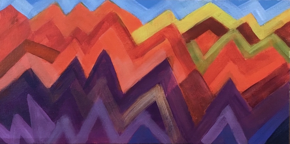
Mountain Ranges
I wanted to get more experience with all the wide variety of oranges available, from yellow-orange to red-orange, and wanted to pair them with purples in a new bunch of sketches. I also wanted to play with more ideas for abstracts. This idea I had fun with a couple years ago with Volcano Country; I've always loved living around mountains, and much of my time in the western US has been with some visible from my home.

Orange and the violet used in this sketch are two thirds of a triad. For this one I threw in some single-color accents of yellow, yellow-green, and blue, just to see how they went together. Yellow-green and blue are half of a tetrad with orange (and red-violet, missing here.) I subscribe to the idea that color combinations are completely analagous to chords in music, and that you can get a lot more interesting  art when you use more complicated harmonies. Sometimes what you leave out is as important to the feeling as what you put in. But whether or not any combination actually works in a painting depends on placement in relation to the other colors, relative size, saturation, and how it supports both the subject and the idea of the painting. Only seeing and feeling it can tell you if you've hit the mark—you have to play to learn.

I think if I moved these colors around in the painting I could get several different moods, as I could if I used different values. It's a mix that carries a lot of energy and seems to beg a lot of "why?" questions, which really stimulates my imagination. Orange suggests earth and sex; violet points to spirit and the higher mind. Orange feels grounded and practical; violet leans toward infinite space and unbounded imagination.

One thing for sure—I'm never going to get tired of color.

Tuesday, April 18, 2017

Blue & yellow color study sketch


After my experience with blues and yellows not wanting to work together on the daffodils, I thought I'd try a couple color sketches, just to play with them. I wanted to find a color combination that did look attractive to me.

For this first one I used another photo of Catherine Creek I wanted to try, and pthalo blue on land, ultramarine and a bit of dioxazine purple on the river, diarylide yellow in the sky, and diarylide plus primary yellow on the far hills. As soon as I added a couple tints of the blue, it looked like a late evening in winter, which was a surprise, and I was surprised to see how almost realistic the colors look.


I thought the colors looked great together here, so maybe it was the higher proportion of yellow in the daffodils.


In theory, this should have needed some red or red-orange to balance the blues, but I guess the Diarylide, a yellow-orange, adds enough balance to keep it from looking one-sided.You never know what you're going to find out when you start playing. In this case, I found an interestingly pseudo-realistic color treatment.


I spent a couple days last week exploring this same part of the Gorge with friends, and got a lot more photos to work with. I'll be quick-sketching a few of them. Don't know if I'll try any more snow scenes now; maybe in August.
😊

Saturday, April 8, 2017

Progress of skills is not linear


I never thought a two-day sketch of daffodils could be so hard to paint. It was interesting the first day, frustrating the second, really frustrating the third, and after the fourth I was ready to give up. But on the fifth it finally started looking a bit better, and today, it's okay. What took the longest was nailing down the basic colors. I've never done much work with whites except clouds. Lavender was the first tint I tried for the un-highlighted areas on the white petals, and that wasn't awful but it wasn't pretty. Then I tried gray-greens, and blues—I've always loved blues and yellow together, but not this time—before finally settling on an almost teal, which went well with both the yellows and the greens.

The other big problem was that the photo reference was strongly backlit, and I couldn't make that work in two days of trying so I gave up and faked more normal lighting. Once I got that far, it finally got to be fun. Now that I'm ready to call it done I'm thinking how I could have done it better—but that's a major point of sketching—get the first one out of the way, and stop thinking about it. Just get the experience under your belt.

But I did really get a good education in yellows and ruffled edges, and I only rarely work in yellow or orange. I invoked the artist's privilege to outline the coronas in purple; that was anti-realistic and fun. Sometimes I just want to find out what I can get away with—it's good practice drawing with the brush, and 100% approved for sketching. That's still how my mind works, unfortunately—Is this okay? Is it allowed? I sure hope I can get to a point where I can stop worrying about that. The only things that matter are how the painting looks, and what lessons did I get from this one?

Sunday, February 5, 2017

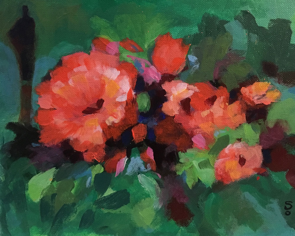
Working with reds

Floral 5
I wanted to try another imaginary floral, this time with reddish flowers. I went with greens just to use the pair of complements, and the orange  and pink bits to extend the range of the reds, but I was hoping to work in some blue somewhere. I worked up to it with blue-greens in the background, then some touches of cyan in the flowers. At the very end I added a few small spots of darkened cobalt right in the center. They are barely visible, but they did have the effect of perceptibly enhancing the color balance.

I never realized how complicated it is to make pleasing compositions from my imagination. I think next time I'll spend a bit more time in the rough blocking-in color-blob stage. But even in a painting with no real detail, it's hard for me to imagine how it will look as a finished piece, and I'm guessing that I'll be playing with a lot of these before I start getting the hang of painting without a reference.

The part I had the most trouble with was making a pleasing pattern of darks around the flowers, and I had to play around with them quite a while, and I think that's why I put the background figure in. Along the way I realized the flower arrangement didn't seem balanced, until I added the smaller dark red flower in the center. I wasn't sure what color I should put in there, but knew it shouldn't be the same red & orange shades as the others. When I put in the dark red, I liked how it added another shade of red in the mix.

Tuesday, January 31, 2017

Sketch painting for practice

Zion Sketch 1
Once again with a full palette after the two florals, I decided yesterday it was time to tackle some of the 1" thick stack of my photos that I've thought about trying to paint, and picked one from Zion National Park. I wanted to do as quick a sketch as I could, just enough to work out if the image would translate to a painting both composition- and color-wise, plus be as interesting as I thought it was as a photo. I already had the colors I needed on the palette, so I grabbed a scraggly brush and started brushing in the shapes, and filling them in with what I already had mixed. Since there were a lot of dark and shadowy areas, I brushed those in as well to locate all the shrubbery and rock contours.

I loosely followed the colors from the photo, inadvertently intensifying them. This composition seems to play the light orange off the fairly-pure yellow of the central tree, but with plenty of support from blue, greens, and the grayed violet. So once again, the same basic combination—yellow & violet, and orange & blue, but this time with a lot more of the yellow-greens. I really can't believe how versatile this set of colors is.

I was thinking as I started that doing sketches would give me both a lot of practice, and a low-pressure place to figure out how to handle the more challenging areas, which in this case were the shadows, the large rock mass behind the front one, and the tree in the foreground. The rock mass I had to repaint a few times, and it took a few tries to get the hue and value of the shadowy areas on the orange rock, but the yellowish tree in front was a lucky break. I like the way the simple shape and bright colors attract attention to the foreground while they're playing off the more distant orange. I had thought I would want to refine the whole painting more, but was happy to find it had a lively rough look that suited it.

I see lots more sketching in my future.

Monday, January 30, 2017

Same colors different balance

Floral 4
I still can't get the paint to run out the same time the painting is done, so I ended up with a palette full of all the same colors after the last one. I flipped the emphasis to blue flowers though, with only bits of darker lime green around them. I finally managed to make an unsymmetrical arrangement, and added the geometric design in the background to set the whole thing off.

My brushstrokes look better in this one, more like the shapes of the flowers. Competely imaginary flowers, sort of salvia-like. It started out with a much more placid orange; this one is more like candy orange slices at sunset.

This one was fun.

Saturday, January 28, 2017

Trusting the chaos

Floral 3
I've started doing quick (for me, that is—one or two days) studies and improvisations. I started with an owl I copied from some photos on the web that appealed to me and that went well enough, after having to re-draw it after I blocked it in, that I decided to try another floral, totally from my imagination. I had a lot of paint left over from the owl, mostly purple, blue, and yellows, so I settled on blue & orange plus purple & yellow. That is not an official color scheme, but I started with it anyway. Along the way I added in some dark yellow green, which seems to have added to the harmony.

I've been wanting to give myself a little more freedom in choosing colors, based on how all the different ways there are to harmonize notes in melodies. Different harmonies convey different emotions, along with implied familiarity, or its opposite, exoticity. This harmony leans toward the exotic, but they're also very common spring colors, and my mind is pretty focused on Spring at this point, hoping to hurry it in a bit.

I collaged a couple paper pattern bits on it, like I did on Hum Day, then tried painting on top of them and made a quick, ugly mess. I let that dry, decided I did want to do a floral, and started again. In the process, I completely covered up the collage, which was fine. I was making shortish, broad strokes, trying to create a nice composition, and that got scary too, as it looked to be turning into another   amateurish mess, when I suddenly thought of Joan Mitchell's flowerscapes. I laughed at myself and decided it was okay to keep playing, just to see what happened. I think about playing at painting a lot,  and I write about it a lot, but I was so afraid of making schlock that I failed to recognize that I was playing. I let go and kept up with the completely non-thinking paint application, and in another couple minutes it started looking like an interesting blocking-in. It's like running down a hill where you can't see what's at the bottom, but it's so fun to run downhill you want to keep going.

So that was the creative part of painting—the scary part where you can't see anything good and you have to trust. Four, five minutes tops, was all it took to see that I had a nice color composition. Then I had to make it look finished. I went through about ten cycles of analyze, paint, analyze, paint over it again—fixing the bad parts, then adding new parts which were also part bad, and fixing those. I was 98% done with it last night, and added a couple tiny bits this morning.

The green strip in the corner was one of those happy accidents. I just wanted to add some more green to the background, and when I held a mat over it, I thought it added immensely to the composition. Without it there, there's just a vase of flowers, but suddenly it's more interesting with that green there as some unknown element in the room. It seems to anchor the flowers into the room, more than the purples in the bouquet do, and throws the darker blue-purple farther back.

Saturday, January 21, 2017

Painting the blues

Spring Blues
Another music painting. In this one I wanted to focus on blues, but surprised myself by using the entire cool half of the color wheel, from yellow to violet. I'm including yellow because it's a cool lemon yellow, not a warm golden yellow. I'm surprised how balanced it looks, being mainly yellow-green and blues. I thought I would have to add some red or orange to balance all the blues, but I never felt the need. Maybe that's because I do include the complementary pair of yellow and violet, and they're acting as kind of bookends. Analogous colors do constitute an Official color scheme, so I haven't violated any laws.

I did a couple things differently on this painting—I left some of the edges a bit blurry, and some of the note bars a little transparent, and made the background a lot more interesting.

Theme-wise, it's expressing my longing for the bright green foliage of spring in this particularly cold January.

Thursday, September 29, 2016

You don't have to stop working on it until you like it


I've had a floral I started many months ago that no matter what I tried, it never got better, so this morning I picked a new color scheme of greens and reds and started painting over it. I blocked in the main colors and the focal point, and then started defining the shapes. After getting that far, I was right back into my old bad habit—thinking about what would make it best instead of just painting! Arggh! So I mixed up more hues and just kept going, minding the color balance and overall balance as best I could until it seemed pretty pleasing and was still nice and loose. I took a photo of it and thought, wow, that was quick! I even posted it on my blog. But the more I looked at it, the more unbalanced it looked, so I deleted the post and the next morning went back to work on it. When it looked better I stopped again, but knew that I'd better let it sit, and before long I realized I wasn't happy with the shape of the green vase. So today—the third day of working on it—I repainted the vase and the area around it—this looser style really makes it easier to repaint areas.

All the over-painting I did gave it a nice texture. My only complaint was that I seemed to be wasting more paint as I almost always mixed too much for the few brushstrokes I made. But I'm way happier with this than any other floral I've ever done and hoping I can keep loosening up.


Thursday, September 1, 2016

Painting without thinking

Dog Made Of Sunlight
I wanted to paint some dogs but don't have any models, so I decided to paint an imaginary dog, and while doing it I would practice painting intuitively, letting the work proceed without me getting in the way. I had been looking at pictures of greyhounds because I think they're beautiful, and made a small paint sketch of a greyhound sitting in front of a big full moon, and figured out how I might create the textures I wanted in the painting. I decided that was a Moon Dog, and I needed to also make a Sun Dog. I sketched out a dog that was sort of like a friend's Corgi, and I wanted him to look like he was made of sunlight.

This was a really relaxed, fun painting to do. I was able to just paint without thinking about what I was doing, or what I wanted the painting to look like. In essence, I was trying to not think about the painting at all, but just to allow my actions to come from a place separate from thought—maybe from the will, or the subconscious—somewhere where I couldn't worry about it, or do anything but watch and enjoy the colors, get the right paint on the brush and put the right amount of the right color in the right place on the canvas. What I did allow myself to do was to evaluate the results, and if I liked them, I left them, and when I didn't like them, I reworked them until I did.

I've been telling myself for a long time that I need to stop thinking while I'm painting, but recently while working on a landscape, I discovered that if I focused my attention on my hands and on observing what they did, I could shut off the thinking part of my mind. It may seem silly, but it was the trick I needed to let my hands just paint without me trying to direct them. The magic part of doing this is that painting becomes relaxing and stress free as long as I keep working. Frequently, I'll come to a point where I stop working and take a minute, but like as not I'll pick the brush back up and go right back to work on some other bit. It might be the same thing I'm doing when I meditate—shutting off the plotting, planning, worrying mind, and just observing.

Frequently, the colors and the patterns I make don't make sense to me at first, and I can't predict the outcome, or tell if it will evolve into the idea I had in my head before I started. More than once I thought, what a stupid idea to paint an imaginary dog! Who would every buy such a painting! But while I had the brush in my hand, while I was mixing colors and slowly building up each part until it began to look both unique and finished, I totally enjoyed the process. There was no worrying while I was painting, just playing without thinking.

The color scheme on this one was red-violet, blue-violet, and yellow-orange. Very fun to play with.

Saturday, June 18, 2016

Music for the eyes

Benny's Bounce
10"x30" Acrylics on stretched canvas $300
If you're interested in this painting, please contact me at patriciaryanart.

Another painting done. I roughed this composition out when I was working on Rhythmism, and it waited till I finished Song For Iris. I was hoping it would have a different look to it, and it does. It's a different take on the blue-orange combination, and feels a lot more energetic and active. I did really enjoy the way the colors and forms began to interweave, and the separate lines interact, just like instruments in a song. With this as with Iris, I wasn't sure how the separate lines would resolve themselves to fit in a two-dimensional space, but they just did, as I kept working. I found that again, I didn't have to think about it or work it out ahead of time—all I had to do was keep working.


Monday, June 6, 2016

A tribute to color

Song For Iris

16"x20" Acrylics on canvas panel SOLD
If you're interested in a painting like this, please contact me at patriciaryanart.

I knew I was going to be able to finish this painting when I finally thought of a name for it: Song For Iris. It's obviously not iris-as-in-eyeballs, it's sort of about iris flowers, but it's really for Iris, the goddess of the rainbow. Color is after all one of my passions.

I picked the violet-yellow pairing in a moment of madness, because I've never done a violet painting before. It is one of the 3 possible primary&complement pigment pairings, so it deserves to be explored, but it was such an unfamiliar combo to me that I really didn't feel comfortable until it was about three-quarters done. I purposely kept the yellows to a very small amount and leaned more heavily on yellow green, which goes so beautifully with red-violet.

I went bigger with this one, too, a 16x20. I was interested in whether or not the music painting idea would translate to a more standard format. I found myself thinking of it as different lines of melody and harmony within a short segment of music, various instruments playing around and in concert with each other.

Fun!


Tuesday, May 24, 2016

Exploring (Exploding!) complementary color combinations

Yellow Backbeat With A Rising Cadence
8"x16" Acrylics on canvas panel $125
To purchase this painting, click HERE.

After finishing this new one last night, I'm thinking I'm just going to stay with blue and orange for a while. The moods of these last two paintings are so different that I'm wondering just how much range you have within a two-member complementary color scheme. It was a real revelation to stop thinking of pairing single colors in favor of pairing their whole families. (Thank you again, Robert Burridge.) Not just orange, but yellow-orange, red-orange, gold, and citrine (green-orange), paired with true blue, pthalo blue, cyan, greenish blue, violet-blue. Take all those shades and multiply them by a few different values, from pale to darkest, and you have a forest of colors to play with.

It's like throwing a party for your favorite couple, and inviting all their interesting friends to come too.

Tuesday, January 6, 2015

Winter time is imagination time


It's January, and the perfect time for playing in the studio. I'm back to working with abstraction and lots of color. Outside it's gray, gray-green, gray-brown, and gray-blue, but in here it's all about rich, bright, and stimulating colors.

Still playing with textured surfaces, having fun with that. And I'm planning on making the most of my imagination in my painting, too. Imagination is the best kind of bank account—the more you take out, the bigger and better it gets. Turn on your idea machine and start using it, and you won't believe how great it works. All it needs is for you to not be afraid to use it.

Friday, October 18, 2013

Two more cloud paintings, this time with landscapes

Afternoon Light

Hooray! The good weather came back for a really nice fall spell. The good news is that I got outside to paint again. The bad news is that I have to take time now to do as much work in my garden as I can, because when this good weather ends, that's most likely the end of it for this year. But I did get out for a few more plein air sessions, and chose to spend them in the northeast corner, looking at a bigger view. (I gave up on the ligularias for now. I'll play with them more in the studio this winter and see if I can make anything out of it. I did get good photos of the leaves while they and the flowers were still looking good, but I know when I'm in over my head.)

I set up in the new spot three days in a row at the same time each afternoon, and the clouds I painted were there on the first day. The first day I came away with what looked like an unfinished underpainting sketch. The second day I turned it into the ultimate in banal mediocrity, truly awful, laden with superfluous detail; it fairly screamed "Bleah!" The third day I attacked it with a larger brush and the intent to loosen it up, make more of the larger shapes, and force myself to go faster so I didn't overwork any of it. Ta-da! Success! It came back to life with a sigh of relief.

But when I looked at it again in the studio, there was a problem—the sky and the ground looked like two separate, unconnected paintings. It took me a couple days to figure out that it was a color issue. I had painted the clouds pure white because that's how they'd looked early in the afternoon when I started on the first day. But by the time I got around to painting the house and trees, I was seeing warmer, late afternoon light on the house, and trying to get the fall colors in the trees. So the sky looked cool, but everything else looked warm. In the studio, I painted over the clouds with the same pale yellow of the house, and that pulled the two parts of the painting together like a good zipper—it was one image now. But the next day I wasn't quite happy with the yellow; I was unable to recall ever having seen pure yellow clouds. So I tried pale yellow orange, and after I did the clouds, I used the same color to warm up the house a little bit. And that seemed to finally do it.

Clouds #12
I tried one more little cloud painting that week, this time on an 8x10 canvas panel. It was an exceptionally beautiful bunch of clouds—for about 3 minutes—then a huge gray mass blew in from the north to cover the whole sky, and it began drizzling. I took shelter under my woodshed overhang and kept trying to paint what I thought I had seen. Fortunately, I had my camera with me and had taken a shot right before I started painting. When I got back in the studio and looked at the photo, I hadn't even come close to getting the cloud shapes, so on the next day while it was raining, I tried doing a studio painting over the same panel from the photo. Like the other plain air painting above, it was awful. I tried two different color schemes for the clouds, and they were even worse. So I decided (a) it was too detailed, and (b) I'm no good (at least not yet) at making up cloud color schemes. I searched through my photos for an authentic color source for the clouds and, again, took a larger brush and worked over the painting as fast as I could, not worrying about the brushstrokes but just trying to get the colors and values right. Again, that approach gave me a much better painting. Not great, but not awful, either.

Wednesday, September 18, 2013

Slow progress

After 5th session
It turns out that I picked a really difficult subject in this ligularia and the complex background behind it, but I am slowing making progress. Good thing, because the nice days of painting outside are coming to an end soon. The things that make the ligularia a really choice subject are the same things that make it really a bugger to paint—those big, reflective, undulating leaves, with their visible veins. They're a lot like painting drapery, they are so smooth and curvy and show so many different shades and hues of reflected light, and I have pretty much no experience whatsoever painting drapery. But today I felt like I finally found a good mix of colors to use for the background. The painting is a long way from done still—especially the ligularia leaves—but at least I like the mix and general arrangement of colors.

My previous experiences doing plein air painting, before I started painting in my garden, were with groups who would drive somewhere, paint for a few hours, then leave and come home. I wasn't anywhere near good enough nor quick enough to paint anything worth keeping, so it became ultimately something I had no interest in doing. However, being able to go out almost every day to the same spot and work, not have to schlep the larger pieces of equipment, and be able to take some amenities out with me, like my ipod loaded up with great music, is so different it doesn't even seem comparable. I really enjoy my sessions outside. I always give myself the first five minutes or so to relax, settle into the garden, and remember how much I love being outside in it on nice days. That always puts me in a good mood, and then I start looking at the painting, looking for where I can make headway on it that day. Although I never would have tried the ligularia if I had realized how long it was going to take me, at my stage there is no painting that doesn't help my skills, no matter how slow it goes.

As my summer painting winds down to its inevitable end, it seems that I've learned a fair bit about what colors my plants show in outdoor light, and I expect that knowledge to improve my studio painting this winter. I've had so much fun doing this I'm going to really miss it when it gets cold, and I'll really be looking forward to being able to go out again when the weather gets friendly enough next spring or summer.

Clouds #8

This cloud painting I did two days ago. I got a late start and as a result, got to see some sunset hues on parts of the cloud masses.

Outdoor setup

I'm including a photo of my setup, luxurious as it is. The cloth chair with foam padding in the seat and back is one of the most comfortable outdoor chairs I've ever had, and it makes a great painting seat. The purple bucket on the ground is what I use to carry paints, water, brushes and paper towels down from the house. It works great.

Sunday, September 15, 2013

Redeemed by color


I have a small canvas panel that I worked on a couple different times last winter, trying to portray bright sun on an early winter morning, but I couldn't get it to look any way that was pleasing to me. I couldn't go out painting this afternoon, it was too breezy and too darkly overcast—yep, fall is coming soon—and I was desperate to play with my paints, so I picked it up and decided to paint over it with a wide brush and the same colors I'd been using, for the most part. The only color substitution I made was a blue violet for red violet, but I also used a lot more yellow than I did before.

I finally like it! I like it for the simplicity, and for the colors, and for the feeling of it.

It's a little scary to think that I can't get through a quiet afternoon without painting, but, oh well...be careful what you ask for. I feel much better now.