Showing posts with label abstract. Show all posts

Friday, January 18, 2019

Painting a loss


I was in the middle of working on a landscape painting when my brother called to say that our mom, whom I'd just spent a few days visiting in hospice, had passed. Just a week shy of 94 years old, her body had been almost completely disabled by a massive stroke. Later that day as I was standing in front of the canvas again, I wondered what it would look like to see a person's life energy leaving the body and going back to the timelessness of the quantum vacuum, as it's now called. Instantly I saw this beautiful image in my mind, and really wanted to paint it, as symbolic of Mom.

Now I remember those first days after her passing as full of thoughts of her long and purposeful life, our family, and the love between us, not of the pain of her loss. The hours I spent working on it were actually happy—like I was being imprinted with the true nature and beauty of Life, instead of the sadness of physical loss. It became a permanent memory of her, from the point of view of that unknowable, non-physical part of us. When I look back on those first days after she passed, they're full of love, not of pain. I'm very thankful for that.


Saturday, February 3, 2018

Discovery vs. Planning

House of Love
This one evolved quickly to something very different from what I started to paint. As Bob Burridge would say, it turned left quickly and kept going all the way to the end. I started with a random distribution of the large, short strokes, playing particularly with the violet and red-violet against a yellow-orange background. I covered the canvas the first day and was totally unsatisfied with what it looked like. The next morning I decided the problem was exactly that—it looked random, and stationary—with no direction or energy. I first worked on developing two dark areas, but it still didn't have any energy so I began repainting it, organizing the strokes into to groups and a movement pattern began to emerge.

Pattern begins to emerge
At that point I started liking where it was going, and realized it wanted to be vertical rather than horizontal. I kept working with that, adding more groups and finding a pleasing pattern with the different hues of violets and yellow-oranges. I'd give anything if I could figure out how to get the many shades of yellow orange to translate to computer images. I tweak the heck out of them in photoshop, but my camera doesn't capture them correctly (the top photo is pretty close, though.)

It was actually the twisted colors in the photos that led me to add the bits of green to balance the one-sided hot palette, though—a real serendipity because I would never have come up with that, and I really like the green with all the oranges now. It's closest to a violet-orange-green triad, but with a lot of intermediate colors.

The title came to me as soon as the pattern emerged, but I couldn't understand it till it was totally finished and I realized how symbolic it was for me personally, having to do with personal growth and the challenges of life.

My process ended up being largely one of discovery and invention, rather than executing to plan. As soon as I focused on letting it evolve, finding the things I liked and being OPEN to keep repainting until it began to talk to me, it became fun and kind of exhilarating to work on it. Scary, definitely challenging, but very rewarding in the end.

Monday, July 31, 2017

Almost to the fun part


I've been making slow progress on the painting, and have almost finished the underpainting. After getting the more detailed photos I wanted, I'm tweaking the shapes of the bluffs on both sides of the river—and taking a lot more time than I thought I would need to do it. But I've started putting in some shape details and playing with colors a little on both the land and the clouds, which is fun doing this big.

I finally rearranged the easel setup so I can see the tv in my studio while I paint. I'm so used to watching dvds or streaming while I'm painting, I was really missing it.

It's going to be really hot here for the next week and a half, to hot to do anything outside besides water, so I should get a lot done.


Friday, July 14, 2017

A Bigger Gorge


I'm following in the steps of David Hockney and Robert Burridge and taking on my first ever multiple-canvas painting—and it's a big one. A triptych 4' high by 9' wide—three 36x48 canvases. I've done singles that size, even a 36x60 once, but this is a whole new level of largeness for me. It's going to make this studio feel pretty small, I'm thinking.

The design that my client chose is my little gorge sunrise sketch I did in May:


Since the design has so many lines that continue across two of the canvases, I have to have some way to line up at least two at a time for the drawing, the color matching, and the finishing touches—hmmm, that's about 80% of the painting time—so I'll be pressing my folding show rack into service. I was very happy to find out that it's plenty big enough to hold two.


I'll be blogging this all the way to its hang-up in a North Portland office building! I'm guessing it'll take me 2-3 months to finish. I think the biggest challenge is going to be to create enough texture and color detail to make it interesting at that size when the design is so simple. That may not be a problem at all, but it's the thing I'm most concerned about right now. Well, that and getting around in my studio while it's in here. I had to do some clean-up, some clear-out, and move one chair out to the garage,  but that's not bad. I've always wanted to paint big, so here's my chance to find out if I do like it!

And when I'm done, it'll be Autumn!

Wednesday, May 10, 2017

Playing "Why don't I like this painting?"

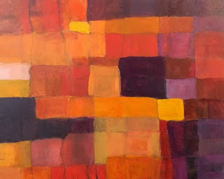
Chili Drawer
I was ready to try a larger (16x20) abstract, something very simple, but a deeper exploration of the color range of oranges. I divided the canvas panel into a grid and started painting every shade of orange I could come up with, plus deep violet, which is really a darkened red violet.

When I finished the first pass, I wasn't happy. I decided the rectangles were too small and too many.

I took black charcoal and and drew a new grid, with fewer lines, giving me fewer rectangles with a wider range of sizes. I let it sit like that till the next day, all the time feeling like those charcoal lines over the colors were the most beautiful thing I'd ever painted.

But I also realized that in normal evening roomlight, I could barely make out what was in the painting. I had used so little white, wanting more intense colors, that only the yellow bits and the pale orange were visible; everything else looked like shades of dark brown. It was a values nightmare.

The next morning I looked at it and went "Ew!" I hated the lines—it seemed to be all about the lines—there were too many, too dark. In fact, I was so disappointed with the work that I had a little crisis of confidence—Why had I been so happy the day before with what was obviously awful?

So I took the colors I already had mixed and added varying amounts of white into them and repainted all the rectangles lighter—some a little, some a lot. I deliberately made all the lines except some of the ones around the edges either fade a lot or disappear. I also took advantage of the first grid to make a couple translucent overlapping shapes and some fairly small rectangles to make the design more interesting.

As soon as the lines started disappearing I realized that drawing them had been a good thing, they just weren't finished—they were just an intermediate step to a better version. The painting went from crap to promising in less than fifteen minutes once I started working on it. I realized then that I would start liking it again when it was a "good" design—one that I thought was interesting.

One more reminder to just keep painting when I do something that doesn't look good.

During this step I literally discovered red-oranges. For some reason I had really never gotten around to playing with red-oranges, and found several discernible hues I could reliably mix. That extended my palette enough to do a large number of unique rectangles without going all the way to red.

When I fixed all those problems, I noticed an as yet unnoticed grouping of rectangles that I wanted to repeat, so I found a similar grouping and re-colored it so it connected visually to the first one.

I've already used some of those red-oranges in another painting I'm in the middle of struggling with, so that was well worth the learning.

Friday, May 5, 2017

Exploring more orange "chords", with purples this time

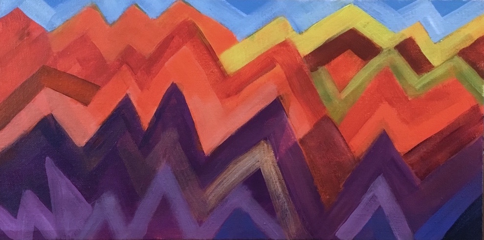
Mountain Ranges
I wanted to get more experience with all the wide variety of oranges available, from yellow-orange to red-orange, and wanted to pair them with purples in a new bunch of sketches. I also wanted to play with more ideas for abstracts. This idea I had fun with a couple years ago with Volcano Country; I've always loved living around mountains, and much of my time in the western US has been with some visible from my home.

Orange and the violet used in this sketch are two thirds of a triad. For this one I threw in some single-color accents of yellow, yellow-green, and blue, just to see how they went together. Yellow-green and blue are half of a tetrad with orange (and red-violet, missing here.) I subscribe to the idea that color combinations are completely analagous to chords in music, and that you can get a lot more interesting  art when you use more complicated harmonies. Sometimes what you leave out is as important to the feeling as what you put in. But whether or not any combination actually works in a painting depends on placement in relation to the other colors, relative size, saturation, and how it supports both the subject and the idea of the painting. Only seeing and feeling it can tell you if you've hit the mark—you have to play to learn.

I think if I moved these colors around in the painting I could get several different moods, as I could if I used different values. It's a mix that carries a lot of energy and seems to beg a lot of "why?" questions, which really stimulates my imagination. Orange suggests earth and sex; violet points to spirit and the higher mind. Orange feels grounded and practical; violet leans toward infinite space and unbounded imagination.

One thing for sure—I'm never going to get tired of color.

Monday, March 6, 2017

Tilting Perspectives

Tilting Perspectives
Believe it or not, this started out as color blobs too, intended to make an abstract, but it quickly became all about straight lines, boxes, and angles, with a composition that suggests structures on top of a tilting, collapsing foundation. It could be symbolic of a lot of things, but in a positive mode it makes me think of outdated, outmoded ideas that just don't hold up any more, and how everything built up on them is headed for the recycling (or trash) bin.

Artistically, I felt like the big problem was to make a coherent image with patterns that might be recognizable as familiar objects, like a cityscape, and I don't think I quite got there. it was interesting working in such a limited color range.

It was extremely slow to work on and a real test of both my resolve (aka stubbornness) and trusting my hands to make something interesting. Clearly I need a lot of work on the latter. I kept wanting to make more different patterns, but when it got so chaotic I could barely look at it, I started seeing ways to simplify it. I think once I decided what it "meant", I over-emphasized that to the detriment of the visual impact.

Looking back over my work since New Year's, I get the feeling that I'm going through a phase where I have to try every style I've ever liked at all. I love colorful geometrics. If there's an opposite to "loose", this is it. I think I'd better try more abstracts. I like some things about it—the range and arrangement of values, the repeating white (formerly) verticals, even the hard edges.

I've almost talked myself into painting over parts of it, but I'll let it sit a while longer.

Tuesday, February 21, 2017

Lessons from the imagination


This was another interesting journey into the unknown. My intent was a loose floral sketch in a new color scheme with a dark background, and to start without drawing, make color blobs and see what developed. I started with mahogany—blackened red—for the dark upper background and instead of the complement of green, I chose a split complement of yellow-green and blue-green. When I went looking for other colors for accents, I added yellow-orange and a grayed blue-violet to complete the harmony.

As much as I was enjoying the way the colors played together, it chafed me that I had chosen such an unrealistic color for the flowers. There are many kinds of green flowers, but none like these. But instead of restarting I chose to stay with it and see if I could make another interesting composition out of it, as an experiment, to prove to myself that reality is not necessary to make an eye-catching painting.

In my last painting it seemed that a contrasty light-dark composition was what attracted my eye most strongly, and I wanted to test that in a different set of colors. Whenever I got stuck wondering what I wanted from this painting, I knew it would have been easier and quicker to copy an image I already had. Because I couldn't do that here, I had to let my imagination guide me. But, if you want to grow a muscle, the best way is to use it, so I chose to paint what did come out, and it was these giant mutant primulas.

The hardest part on this one was creating the light-dark pattern from my imagination—I don't seem to have any facility for that at this point, and that's one of my big motivators to do all these sketches. I went through several stages of moving the light areas around, shrinking them and growing them. When there was too much light, the painting lost its center and looked like a less interesting piece of a larger painting. I had to surround the flowers with dark in order to keep them inside the frame.

I also wanted to play with outlining, as that seemed another way to draw attention to particular elements of a painting, to be a substitute for detail. I can tell that it definitely works for that, just as shadows do. But here, it was really too much until I strengthened the lines on all the stems, and outlined the orange flowers in a less dramatic color.

This is why I'm sketching—to learn all these lessons. Now I have more ideas to play with as I'm working out my next compositions.

Saturday, February 11, 2017

From color blobs to abstract

Landscape
This time, I did begin by painting color blobs. I started with greens and only expanded to yellow and pthalo blue, plus black for the fern greens. I started out with a lighter blob at a typical center of interest point and then surrounded it with darker blobs. I built outward from the center till the paper was covered, then added the rectangular blocks. At that point I felt like I liked the composition, the light and dark patterns, and was really happy with the colors.

I also thought it reminded me of an aerial view of a complex of buildings in a green landscape. Today I decided I just wanted to clean up the edges, overlaying lighter or darker colors to please myself. I drew the few lines to support the idea of structures, and to draw the eye toward that left yellowish block. I'm trying to remember to only put detail around the intended center of interest.

At last—an abstract sketch! From color blobs! With a design I like, which was my goal.

Monday, January 30, 2017

Same colors different balance

Floral 4
I still can't get the paint to run out the same time the painting is done, so I ended up with a palette full of all the same colors after the last one. I flipped the emphasis to blue flowers though, with only bits of darker lime green around them. I finally managed to make an unsymmetrical arrangement, and added the geometric design in the background to set the whole thing off.

My brushstrokes look better in this one, more like the shapes of the flowers. Competely imaginary flowers, sort of salvia-like. It started out with a much more placid orange; this one is more like candy orange slices at sunset.

This one was fun.

Saturday, January 21, 2017

Painting the blues

Spring Blues
Another music painting. In this one I wanted to focus on blues, but surprised myself by using the entire cool half of the color wheel, from yellow to violet. I'm including yellow because it's a cool lemon yellow, not a warm golden yellow. I'm surprised how balanced it looks, being mainly yellow-green and blues. I thought I would have to add some red or orange to balance all the blues, but I never felt the need. Maybe that's because I do include the complementary pair of yellow and violet, and they're acting as kind of bookends. Analogous colors do constitute an Official color scheme, so I haven't violated any laws.

I did a couple things differently on this painting—I left some of the edges a bit blurry, and some of the note bars a little transparent, and made the background a lot more interesting.

Theme-wise, it's expressing my longing for the bright green foliage of spring in this particularly cold January.

Monday, January 2, 2017

Painting comes out of nowhere

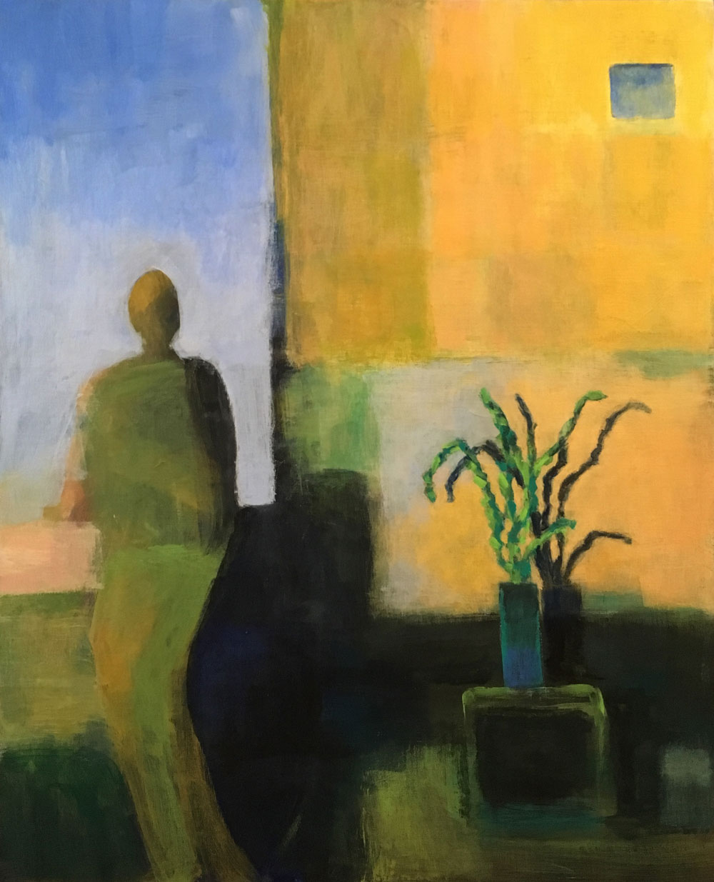
Southwest View
Ever start on a painting and think it's going to be a walk in the park, and then you find out the park is Denali National Park and you're getting dropped off at 18,000 feet?

I had one like that early in December—I repainted every part of it at least three times, and I was beginning to wonder, is this painting? Or trial by brush? Sometimes making a painting is an expression of joy; other times it's a test of my resolve. How stubborn am I?

Then I got inspired to work on one of my half-done book manuscripts, and left it—abandoned it, really—on the easel. Every day after that, I disliked it a little more and got more and more angry that I'd wasted a good 16x20 panel on such a conspicuous failure. The only reason I didn't paint over it at that point was because it was a concept I really wanted to do. So much for that.

Then just after Christmas, I was sketching with my brand new Pitt Pens with brush tips that I got myself for Christmas 😀, and got an idea to do a self-portrait with a plant. I set up my paints again and started painting over it. I blocked in a figure and a plant, and then a bunch of abstract shapes in the background, thinking about how I wanted to rough in the dark-light balance and decide on colors before I started shaping anything. Within an hour of completely relaxed, fun painting, I had a rough composition that I liked very much just the way it was. It didn't look anything like my initial sketch, but so what? I wanted to leave it rough on the figure and background, but wanted to make the plant and pot more defined, adding a shadow to emphasize the idea of bright, sharp light and a defined space. The only change I made after that point was to add the little window to make the top part of the painting as important as the middle and bottom.

I kept remembering what Burridge says, "Don't fall in love with it too soon," but I really was in love with it. I did keep playing with the image in photoshop, to see if I wanted to change the colors or add other elements, but I didn't want to. When I got it to almost final, I showed it to a couple friends and they both liked it. So here it is. It's so completely different from anything I've ever done that I'm still getting used to it. I'm thinking of it as minimalist. My first minimalist painting.

BTW, I really do love my Pitt Pens. I had ordered two small manga sets from Blick, and enjoyed playing with them enough that I decided to make myself a custom set and ordered 25 more colors in the regular brush tip, including a big size "opaque" white pen. It's only semi-opaque, but still quite useful for lightening and adding highlights. You can get very fine lines with the brush tip, or nice 2mm strokes, but if you only want to do fine lines, you can get a few of the colors in a superfine nib. They're $2 each, less in the sets. I bought a small Strathmore 300 Mixed Media Pad and it's perfect for them—no warp, no bleed-through. The only thing about the pens I wish is that they had pale colors in more hues, but that's where the white pen comes in handy. I love having different shades of grays to sketch with, especially trying to do faces.

I hope to do a lot more sketching this year, both to play and to rehabilitate my now very rusty drawing skills.

Friday, October 14, 2016

More inventing = More fun ( Plus, SALE Announcement Below!)

Dog Made Of Moonlight
The moon dog is finished! For quite a while I wasn't sure I could scale up my 8"x10" sketch to 18"x24" and have it be interesting at all—it was such a simple design that it looked rather empty, like a dinner plate with two croutons on it. I was ready to paint over it and start again on a smaller panel when I finally got an idea to break the background into horizontal strips and just apply the paint within the strips. Desert landforms frequently have a noticeable horizontal aspect to them, with their different-colored strata and contours. I used a 7/8" brush and worked quickly and roughly, sticking to my color triad of red-violet, blue-green, and yellow-orange—plus blue which didn't belong but I liked it anyway—and making the values a bit on the imaginary side. I stopped trying to make it look realistic, settling on making it attractive and interesting as my main goal.

I was initially surprised by how much the rough, blocky strokes evoked the feeling of rocky bluffs, and it was fun playing inside the lines—sort of like taking the rules and using them to cheat, exploiting a design element in an unrealistic way to emulate the natural features of desert cliffs and canyons. I wasn't sure how best to use the two main colors so I just kept interleaving them, varying the values to support the overall design. As with my other recent paintings, a lot of my inspiration came from Bob Burridge—"If you don't like the direction, turn left and and keep going."

Like my sun dog, this lady is a spirit, made purely of moonlight, with an ethereal, reflective quality; an observer and thinker, far-seeing and wise.

****ANNOUNCEMENT****ANNOUNCEMENT****ANNOUNCEMENT****
I'm painting so much now my studio is crammed full and I'm running out of room!!

20% OFF EVERYTHING IN MY ETSY STORE THROUGH OCT. 31!!!!

Saturday, June 18, 2016

Music for the eyes

Benny's Bounce
10"x30" Acrylics on stretched canvas $300
If you're interested in this painting, please contact me at patriciaryanart.

Another painting done. I roughed this composition out when I was working on Rhythmism, and it waited till I finished Song For Iris. I was hoping it would have a different look to it, and it does. It's a different take on the blue-orange combination, and feels a lot more energetic and active. I did really enjoy the way the colors and forms began to interweave, and the separate lines interact, just like instruments in a song. With this as with Iris, I wasn't sure how the separate lines would resolve themselves to fit in a two-dimensional space, but they just did, as I kept working. I found that again, I didn't have to think about it or work it out ahead of time—all I had to do was keep working.


Monday, June 6, 2016

A tribute to color

Song For Iris

16"x20" Acrylics on canvas panel SOLD
If you're interested in a painting like this, please contact me at patriciaryanart.

I knew I was going to be able to finish this painting when I finally thought of a name for it: Song For Iris. It's obviously not iris-as-in-eyeballs, it's sort of about iris flowers, but it's really for Iris, the goddess of the rainbow. Color is after all one of my passions.

I picked the violet-yellow pairing in a moment of madness, because I've never done a violet painting before. It is one of the 3 possible primary&complement pigment pairings, so it deserves to be explored, but it was such an unfamiliar combo to me that I really didn't feel comfortable until it was about three-quarters done. I purposely kept the yellows to a very small amount and leaned more heavily on yellow green, which goes so beautifully with red-violet.

I went bigger with this one, too, a 16x20. I was interested in whether or not the music painting idea would translate to a more standard format. I found myself thinking of it as different lines of melody and harmony within a short segment of music, various instruments playing around and in concert with each other.

Fun!


Tuesday, May 31, 2016

Painting and music are almost the same thing

Rhythmism
15"x30" Acrylics on stretched canvas $325
If you're interested in this painting, please contact me at patriciaryanart.

While I was working on this one, I couldn't stop thinking how much painting a picture is like recording a song. Take out the words colors, hues, tints, shades, intensity, and replace them with words like notes, chords, harmony, volume, and tempo, and you're essentially talking about the same process. It starts with your imagination, you make all the forms and put them together, then you balance them against each other, adapting each one. Then you spend the rest of the time perfecting each bit, integrating it into the whole, and then perfecting the thing as a whole.

As I was doing the final tweaking of the lines and angles, I also thought how that was just like editing a piece of writing, checking for typos, homonyms, and the gremlins of print.

One problem I did not have with this piece was my usual wavering. Whenever I came to a spot I wasn't sure how to deal with, I just thought of it as a piece of music and that helped me see what I wanted to do with that particular bit.

I started my next one this morning, and it's also going to look different from the ones before it, but still blue and orange. In fact, I had to order more paint this morning.

Tuesday, May 24, 2016

Exploring (Exploding!) complementary color combinations

Yellow Backbeat With A Rising Cadence
8"x16" Acrylics on canvas panel $125
To purchase this painting, click HERE.

After finishing this new one last night, I'm thinking I'm just going to stay with blue and orange for a while. The moods of these last two paintings are so different that I'm wondering just how much range you have within a two-member complementary color scheme. It was a real revelation to stop thinking of pairing single colors in favor of pairing their whole families. (Thank you again, Robert Burridge.) Not just orange, but yellow-orange, red-orange, gold, and citrine (green-orange), paired with true blue, pthalo blue, cyan, greenish blue, violet-blue. Take all those shades and multiply them by a few different values, from pale to darkest, and you have a forest of colors to play with.

It's like throwing a party for your favorite couple, and inviting all their interesting friends to come too.

Saturday, May 21, 2016

Painting music

Blue Projection
8"x16" Acrylics on canvas panel
To purchase this painting, click HERE.

While I was working on my last painting, I went to Bob Burridge's website and watched a lot of his videos. I've always enjoyed his figurative series; they're very personal, original, and of course brilliantly colored. I was wishing (again) that I could come up with a personal theme for a series that would last me more than a few ideas. There was some particularly interesting jazz playing on KMHD, and this image appeared in my head that I knew was a visual representation of the song I was listening to, and it was as interesting to me as the song was. I thought, I love music, I should paint how music sounds to me. It felt like the best idea I'd had in years.

I let the idea incubate while I finished up Council Crest, then made my first attempt. It didn't look appealing at all until the second pass when I started layering the colors, and from that point I just got more and more into weaving the two main color groups together. It does not look much like my original idea, so I have to keep trying for that, but that's a problem I'm happy to have.

It's been a long time since I've painted an abstract anything, and I've really enjoyed the freedom of doing one again. I really do need the practice in working playfully and experimentally, and it's so much more relaxing to do that when there's no limit to the liberties you can take.

The color scheme owes a lot to Bob Burridge's examples and his goof-proof color wheel, and his message about painting for fun can't be repeated often enough. I regularly visit his website when I'm looking for inspiration.


Sunday, November 8, 2015

Playing for play's sake


I've been craving play time for a couple months, after a summer of what felt like work work work. The mobiles were a good start, now I'm taking it further, into playing with stamping inks and markers, just to have fun and try to do something where I'm not thinking about the outcome while I'm working.   Maybe it's not possible to work toward a specific result without thinking about it while you're working, but I'd still like to try. I'm hoping if I can get more used to the feeling of working with complete abandon, that it could become a little bit of a habit.


I really do love the colors! Of course they don't stay rich because the markers soak into the paper and fade, so the photo is really the only permanent result. But I'm going to try it with some acrylics soon.

Of course I had to try it with a design, too:

Thursday, January 15, 2015

Figures, loosely—an experiment


I've had this panel sitting in a pile with an outline sketch on it for the last seven or eight years, from the last time I worked from a live model. I'm trying to use up all my old panels this winter. I haven't finished a painting of a figure for almost twice that long, and the last one I started got painted over with a sunset. I was curious to see if I even could paint a human, just loosely, and again I started with the texture, just seeing what would happen.

Originally, the panel was to represent the Three Muses. I think it still does, but I don't feel they're talking about work; they don't look as though they're talking about inspiring anyone. I feel they're talking about themselves. Maybe that's what they're doing when you can't find anything to inspire you. But surely even Muses deserve a little time for themselves.

I do think I'm getting the hang of working with drier paint, at least, scumbling and dragging it around.