Showing posts with label mountains. Show all posts

Thursday, August 26, 2021

A new series with lots of trees and foliage


Mt Adams Early Light

Some friends asked me for paintings from three different photos they took on a July 4th camping trip, taken on different days and at different times of the day. I love Mt. Adams so I was happy to take the challenge. I took some liberties with the composition, bringing the mountain more forward (and larger) behind the middleground, and also making sure the dead branch was the same in each painting, as it was a feature for them. After taking the photos they noticed that it was always there even though the locations were different, so they asked me to put it in.

Mt Adams Sunny Day

The most interesting part for me was the difference in the lighting and how to capture that. The foliage in the sunny photo was a real test of patience, as the mix of white oaks, pine, and firs created a tapestry of greens and leaf outlines and textures. I didn't want any more detail than I needed to convey the mixed forest. I ended up blocking in the dominant color shapes before I worked on the detail. That and trying to match the subtle gradients in the sky colors took twice as long as I expect. The blues in the sunny photo were so close I literally couldn't tell if I had the right color or not as I was putting on the wet paint, and I had to wait till it dried and darkened to see if it was right. There was a very slight hue difference between the mountain and the sky, that also helped me get the colors mixed up occasionally. There was a lot of repainting on that one.

Mt Adams Sunset

The sunset picture gave me some good practice with shadow colors. As I've found before, shadow colors in the afternoon and evening are frequently warmer than one would think. All in all, it was a fantastic practice in drawing, painting the pine trees, and in color mixing. And I still love Mt. Adams.

Wednesday, October 24, 2018

The paintings that don't kill us make us...

Rain Clouds Over Mt. Hood

...frustrated? humble? or just more stubborn?

This painting started out as a formidable adversary, and never let up till the last brush stroke. Which may be partly because I had a really clear vision of how I wanted it to look. I wanted the perfect combination of blue-violet and yellow-orange—tertiary colors, and complements—and I wanted Mt. Hood to look as massive and impressive as it feels when you see it, despite its distance and the more overwhelming drama of the thick, dark rain clouds.

It didn't help that for the more than two months it sat on my easel I was never able to give it more than one or two sessions a week, and some weeks, nothing. It's been so long since I started it that I don't even remember all the problems I ran into, but I do know the two biggest were giving sufficient detail to the bluffs and getting the colors balanced to give me the harmony and mood I wanted.

I really hope it's true that the more you struggle with obstacles, the more you learn in the process. But I guess if this demonstrated again that the key to success of any kind is to not quit till you're happy, then that's lesson enough for me. Never give up! Never surrender!


Friday, May 5, 2017

Exploring more orange "chords", with purples this time

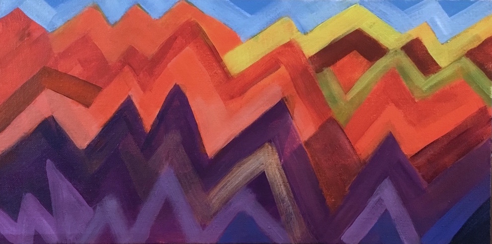
Mountain Ranges
I wanted to get more experience with all the wide variety of oranges available, from yellow-orange to red-orange, and wanted to pair them with purples in a new bunch of sketches. I also wanted to play with more ideas for abstracts. This idea I had fun with a couple years ago with Volcano Country; I've always loved living around mountains, and much of my time in the western US has been with some visible from my home.

Orange and the violet used in this sketch are two thirds of a triad. For this one I threw in some single-color accents of yellow, yellow-green, and blue, just to see how they went together. Yellow-green and blue are half of a tetrad with orange (and red-violet, missing here.) I subscribe to the idea that color combinations are completely analagous to chords in music, and that you can get a lot more interesting  art when you use more complicated harmonies. Sometimes what you leave out is as important to the feeling as what you put in. But whether or not any combination actually works in a painting depends on placement in relation to the other colors, relative size, saturation, and how it supports both the subject and the idea of the painting. Only seeing and feeling it can tell you if you've hit the mark—you have to play to learn.

I think if I moved these colors around in the painting I could get several different moods, as I could if I used different values. It's a mix that carries a lot of energy and seems to beg a lot of "why?" questions, which really stimulates my imagination. Orange suggests earth and sex; violet points to spirit and the higher mind. Orange feels grounded and practical; violet leans toward infinite space and unbounded imagination.

One thing for sure—I'm never going to get tired of color.

Tuesday, January 6, 2015

Winter time is imagination time


It's January, and the perfect time for playing in the studio. I'm back to working with abstraction and lots of color. Outside it's gray, gray-green, gray-brown, and gray-blue, but in here it's all about rich, bright, and stimulating colors.

Still playing with textured surfaces, having fun with that. And I'm planning on making the most of my imagination in my painting, too. Imagination is the best kind of bank account—the more you take out, the bigger and better it gets. Turn on your idea machine and start using it, and you won't believe how great it works. All it needs is for you to not be afraid to use it.

Saturday, September 6, 2008

Eight-at-a-time

Here's one of the exercises I did, mostly in an hour. It's a 14x20" watercolor paper sheet from a block, gessoed and painted with thinned acrylics. I had the basic idea of a tall range of violet mountains, with hills and meadows in the foreground. The idea is to work as fast as possible, and develop all the paintings at the same time, and I did all the mountains first, then all the skies, then all the foregrounds, one color at a time. After I got the foregrounds roughed in, I let it dry completely, then came back and tweaked them individually till I felt like stopping.

Funny things happen when you're working quickly on so many things at once. For one thing, it's a lot easier to keep from getting emotionally attached to any one of them, so you're not so afraid to try something you've never done before. In fact, you have to get more inventive, to keep them from all looking alike. And with all that quick action, things happen that you didn't plan, and you start getting comfortable with that. You don't worry about every stroke. You don't worry that no one will like it, or that it's not going to win any ribbons. As long as you keep working quickly, you don't have time to worry about anything. That's how I want to be all the time—painting and not worrying about it.