|
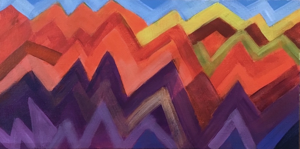
| Chili Drawer |
When I finished the first pass, I wasn't happy. I decided the rectangles were too small and too many.
I took black charcoal and and drew a new grid, with fewer lines, giving me fewer rectangles with a wider range of sizes. I let it sit like that till the next day, all the time feeling like those charcoal lines over the colors were the most beautiful thing I'd ever painted.
But I also realized that in normal evening roomlight, I could barely make out what was in the painting. I had used so little white, wanting more intense colors, that only the yellow bits and the pale orange were visible; everything else looked like shades of dark brown. It was a values nightmare.
The next morning I looked at it and went "Ew!" I hated the lines—it seemed to be all about the lines—there were too many, too dark. In fact, I was so disappointed with the work that I had a little crisis of confidence—Why had I been so happy the day before with what was obviously awful?
So I took the colors I already had mixed and added varying amounts of white into them and repainted all the rectangles lighter—some a little, some a lot. I deliberately made all the lines except some of the ones around the edges either fade a lot or disappear. I also took advantage of the first grid to make a couple translucent overlapping shapes and some fairly small rectangles to make the design more interesting.
As soon as the lines started disappearing I realized that drawing them had been a good thing, they just weren't finished—they were just an intermediate step to a better version. The painting went from crap to promising in less than fifteen minutes once I started working on it. I realized then that I would start liking it again when it was a "good" design—one that I thought was interesting.
One more reminder to just keep painting when I do something that doesn't look good.
During this step I literally discovered red-oranges. For some reason I had really never gotten around to playing with red-oranges, and found several discernible hues I could reliably mix. That extended my palette enough to do a large number of unique rectangles without going all the way to red.
When I fixed all those problems, I noticed an as yet unnoticed grouping of rectangles that I wanted to repeat, so I found a similar grouping and re-colored it so it connected visually to the first one.
I've already used some of those red-oranges in another painting I'm in the middle of struggling with, so that was well worth the learning.