Showing posts with label evening. Show all posts

Tuesday, June 11, 2024

Chasing Monet

Haystack Rock
12"x12", oils on canvas

 I was looking for some new ideas for landscapes and also wanting to do some work with water, I decided to do some of the Oregon coast. I happened on a news article on Monet's water lilies and procured a used copy of "Monet Water Lilies - the Complete Series" by Rey and Rouart. I drooled over it for two days straight, trying to absorb the meticulous looseness, the freedom of not-necessarily-realistic colors, and the magic of the water's surface, the reflections and ripples. He was one of the first painters I studied and he's always been an inspiration to me.
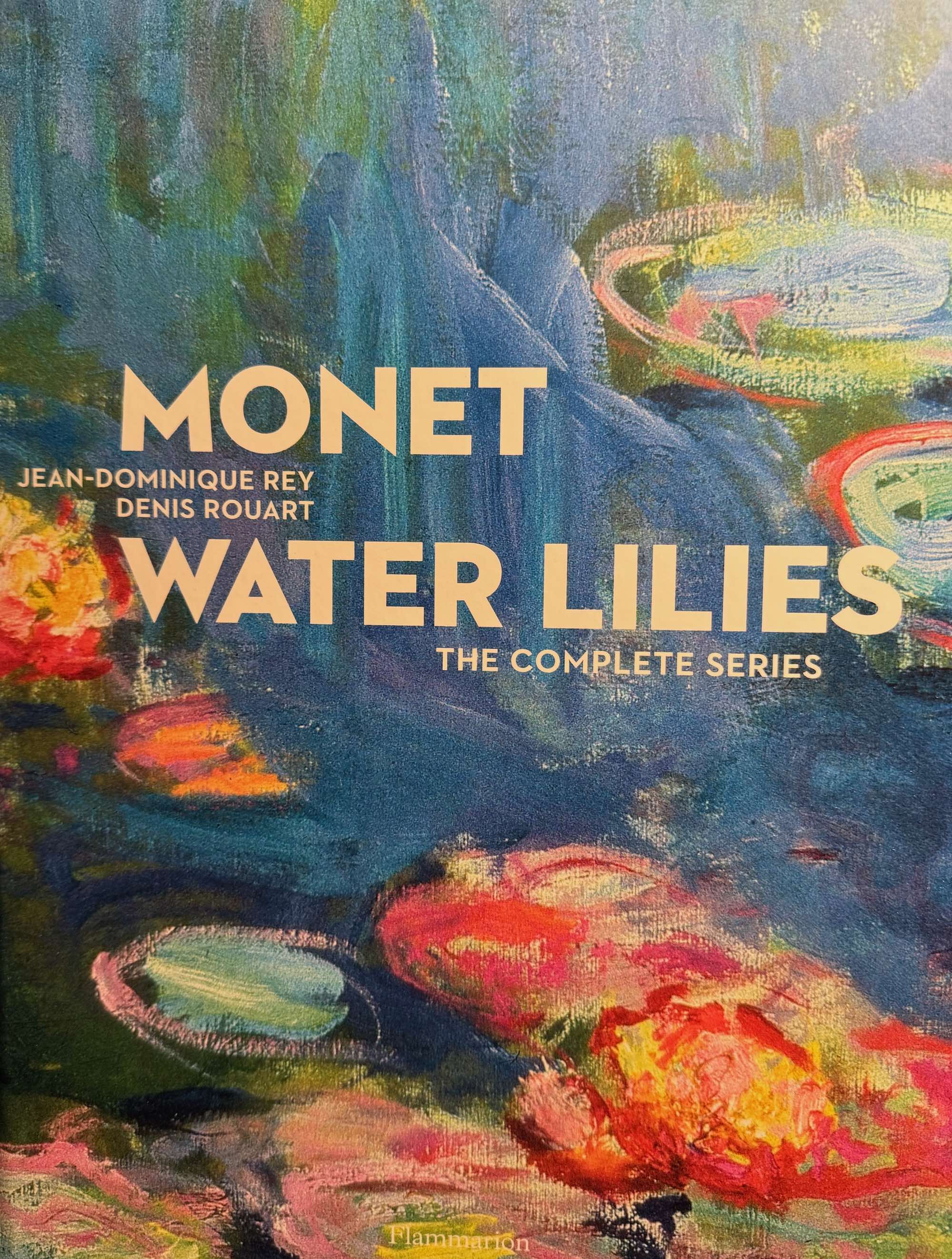


Getting this book means I can stare at the lilies as much as I have time for—it's unlikely I'll ever make it to France! Sometimes parts of a painting look clean and spare, with just a few colors, or very similar pastels that relax the eyes and and the mind. Other times, in dark areas, it looks almost brutal, heavily overloaded strokes of colors that don't seem to make sense, but still convey deep mysterious darkness, lifting up the lighter areas and maximizing their impact. I feel like he's using color as a structural material, and I get the impression that he didn't have any qualms at all about using whatever colors he wanted to, whether his eyes could actually "see" them in the subject or not.

I wanted to paint Haystack Rock in as impressionistic a style as I could manage; by that I mean I wanted it to be loosely done, with vibrant, engaging color and simplicity of shapes, using texture and light to evoke a sense of presence. It seemed to me that his approach on the lilies was to lay in the water first with unstructured strokes, mixing many hues of blues, greens, lavenders, and then more-or-less draw in the flowers and lily pads with dry-brushwork, layering strokes until he got the depth and mix of colors he wanted. He doesn't bother with small details, letting one stroke suffice wherever possible, implying rather than stating, which in his hands conveys not just the water and plants, but a three-dimensional space and the feeling of looking at the subject as if you were standing next to him.

Another modern who impresses me in the same way is Sargent; his economy of strokes really amazes me, and it's a skill I really aspire to. I've heard over and over that suggesting the subject and surroundings engages the mind of the viewer more than explicit detail does, and enhances their sensation of the painting; I believe that is the the way vision works--you can take in a whole scene or you can focus in on one thing at a time.

Now that this one's finished, I'm starting another Haystack Rock, so I can explore other color palettes and more water formations, hoping to get closer to that magic that Monet was such a master of.

Friday, January 20, 2023

Back to Horsethief Butte

I still have at least 100 pictures of the Columbia Gorge that I want to paint, and this time I went back to Horsethief Butte for a south view showing late afternoon light on the western part of the butte, plus the vegetation farther from the walking trail near the massive outcropping. I went with friends just before sunset and I shot many images as the sun slowly dropped behind Mt Hood and the Columbia River. Most of the grass was long gone dry, just the tiny water-hoarding groundcovers still showing any green. Gray, Tan, Ochre, and Orange were the dominant colors. Horsethief sits in the rain shadow of the northern Cascade range so it dries out mid summer to glowing golden slopes between the blue sky and the river reflecting it. It was a beautiful evening and made a lot of memories for me.

Monday, January 19, 2015

Villa Catalana at Sunset

Next day update (1/20/15):

As soon as I posted the painting (see below), I realized that it really wasn't showing the "color feel" I saw in my original photo of the scene, nor was it evoking the mood of the twilight. But, the difference was so subtle that my eyes couldn't register it, just looking from the painting to the photo on my computer. So, I took the original photo and the photo of the painting and viewed them side by side on my computer screen, and got this very interesting comparison:

Left: Painting  Right: Original photograph of the scene
The light bulb finally came on.

This morning I took the painting back into the studio and corrected the colors of the sky, the water, and some of the foliage, including taking down the turquoise of the spiky plant in the foreground. And after that round of corrections and yet another photograph, I realized that I had also not conveyed the warmth of the pavilion area and its reflection, and that they were also very important to the color scheme. So now it looks like this:


I may go back to it tomorrow and tried to even out the water. It was so pretty in the too-blue painting; at least the colors are correct now. Maybe I can make it pretty again.

It's all grist for the mill. Must keep grinding. How could I ever learn to see color without my computer?

END of update.

The Too-Blue Painting
This is the other painting I really wanted to do of the Villa Catalana paint out last summer. I took the photo from their patio, looking toward the west, in the long twilight. The lights were on in the pavilion, and although I couldn't see them from that angle, they were reflecting in the water. I was in love with all the colors, and the water, and the trees, and the perfect summer evening.

I'm staking out another desert painting for my next one.