Sunday, June 30, 2013

New toys, new joys


Garden mobile
I'm branching out in two more dimensions —depth and time. I've been thinking about going into mobiles for about a year. I was wanting to make big ones for the garden, out of the filbert wood I harvested 3 or 4 years ago. But as a first step, to get used to thinking about shape and motion, I decided to go small and make little ones, with some bits of glass in them. This is my third one. The first one is going to get redone, and the second one was pretty good and went to a friend. It's fun to play with making different shapes, and I have many more ideas to play with.

Unfortunately it's a bit hard on my hands and wrists, but I'm constantly trying to find ways to make it easier to bend the large wire. I bought a few new pairs of pliers specifically for bending, and they help a  lot to give me the leverage I need. But I still can't do it every day, which is fine. Plenty of other stuff to do.

Next weekend I'll be showing and selling my artwork, including this mobile, at the open garden of my friend Meredith, both Saturday and Sunday. And I'll be doing the Art In the Garden fair at Laurel Hedge in Estacada the last Saturday in August. It's looking like nice weather for next weekend.

Sunday, April 21, 2013

Acrylics as watercolors

Meadow Afternoon
I found this scene one summer afternoon over a year ago but I never felt I could paint it before. One thing transparent water media are great for is skies.

The first painting instruction I ever had was in watercolor, and I guess some of that experience has stuck with me, because I enjoy painting on paper as if I were painting with watercolors. I do love my acrylics, though, and I'm in no hurry to go back. I love that they're so versatile.


Sunday, April 14, 2013

You must play to be good

Flying Dream
After doing three "serious" paintings in a row, I was desperate to do some things just for fun. I wanted to explore some other colors, and I wanted to try doing a painting purely from my imagination. The painting I wanted to do was a dream I had about 25 years ago—it was the first dream I flew in. I wanted to put background figures in it, I wanted it to be full of color and and very loosely painted. In the dream, I was in a rather boring party in someone's yard, which sloped down towards a street. After standing around for a while, I started running down the slope, and after just a few steps, I leaned forward, reached out my arms, and started flying.

I worked on it for about two weeks, and while that work was ongoing, I did several color studies, just totally painting out of my subconscious, thinking about the colors, and seeing how they played against each other. As I painted, wishing that ideas came more easily to me, I was realizing that it's all about vocabulary—you're only fluent with what you've done. So if you don't paint things that you don't think will work or you have trouble with, you'll just keep doing the same things over and over and you'll never do anything new or bold or innovative. So I played.

I used these paintings to try out two different canvas pads, one made by Fredrix and one with the Dick Blick brand on it. The Fredrix one is sheets of really heavy artist's canvas, and despite my using very wet paint, thickly applied, the sheet didn't warp even a tiny bit. In fact, I wouldn't have even thought about warping except that the Blick sheet warped like a cheap sheet of 90-lb. paper. It mostly flattened back out after I used binder clips on the pad to keep the top sheet stretched, but the edge is still ruffled. Both pads say they're triple-primed, but the canvas in the Blick sheets is so thin that except for the loose weave and cotton threads, I'm not sure it really qualifies as "canvas." It's more like chambray weight, just more loosely woven. So if you want a good heavy canvas pad, the Fredrix ones are great. On the other hand, if you want primed fabric that's probably flexible enough to sew, go for the Blick. It's cheaper than the Fredrix, which is why I wanted to try it.

Paisley
This one didn't do anything except help loosen me up. I do think it looks kind of fuzzy-cuddly.

Expanding Levels
This one convinced me that turqoise and lime green look great together, and also go great with burnt orange and blue-violet. I like the movement in this design. It was on this one that I discovered a new way to mix yellow-green, a very important color for me.
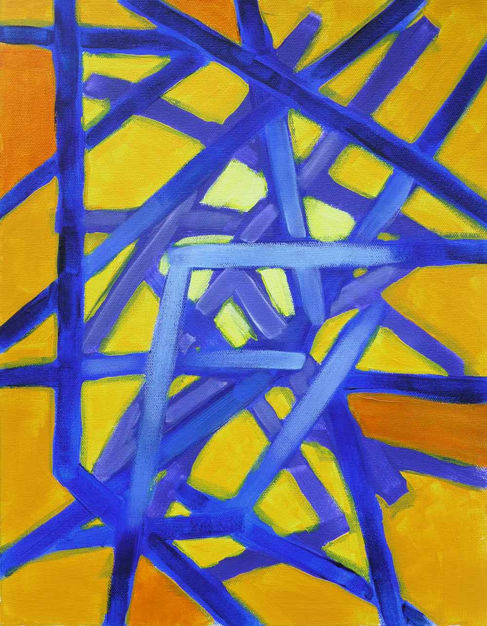
Lines of Direction
This one I resolved to do as an ink painting but with a different arrangement of lines. Love the blue and gold.

Nuclear Dahlia
And this one I worked on for several days, adding one color at a time, as I went from thinking it was a waste, to really enjoying looking at it, even though it's just a dorky flower motif. I think the reason I like it is the colors and the little white highlights, but the radiating form is sort of like a mandala. Or it would be, if it were more carefully drawn.

I really had fun doing all these. Besides finding new colors and new shapes, I also got some practice working wet in wet. The virtue of working on supports that are cheap and take no room to store (if you want to keep them for a while) is obvious. And I can always reuse the heavy sheets. But I think the biggest thing I got out of doing these things is the same value you get from doing any painting—starting with just a vague idea and taking it to some stage of completion. And I was playing—no expectations, no pressure, no tension, just relaxed playing. It was a new experience for me to get up every morning for a couple weeks and feel excited about getting into the studio to just have fun.

Sunday, March 24, 2013

Light as motion


I've been painting more this month than any month I can remember. I finished the fourth in my series of the twenty-two dimensions of light. I'm really happy with the amount of energy in this one. I've never done anything with all hot colors before, either.

I've also been working on several smaller paintings and finished two on paper, including one of a PJM rhododendron blooming last spring, down by my barn. PJM's are a family of rhododendron varieties recognizeable by their lavender to pink to white medium-sized flowers and being just about the first ones to bloom. The ones down at the college started blooming this year at the end of January, which was extremely early. Mine will be opening in a couple weeks, from the look of them.


Another one is another attempt to capture the first light of a December morning, coming through the tall firs behind my house.

Sunday, February 24, 2013

The Nature of Light

One of the reasons I'm enjoying this series is because I really do enjoy working with light. Painting certainly wouldn't be very interesting without it, and I really don't think we'd have a universe without it. It's certainly difficult to imagine any existence without a force as fundamental as light is to our existence. I've finished two more paintings in the series. The second painting is called Light as Force. It feels like strength, or power.


The third painting is Light as Creation. It could be a pool of water, or a mitochondria, or the genesis of an idea.


Monday, February 11, 2013

Twenty-two dimensions of Light


I've started a new series of mixed media abstracts. It's an attempt to show twenty-two dimensions of the fundamental energy of the universe—Light. I finished Radiance last month, and I'm working on the second one now. I'm not sure how far I'll get; twenty-two is a large number, but I have come up with twenty-five possible descriptors. The mathematics of the cosmos has always intrigued me, even though I never got past beginning calculus, and it's been a real treat to see how far astrophysics has come during my lifetime. If I had done better in school, I would have loved to be in on that work. At my age, I figure if I can even contemplate the existence of twenty-two different dimensions, that'll be an excellent workout for my brain...which needs all the exercise it can get.

I've spent the last two rain-free spells re-photographing all the large works I have on hand with my new, better camera, and this weekend I finished getting those images up on my new gallery at Fine Art America, an on-demand reproduction and printing house. All of those paintings are now available for purchase as reproductions in a wide range of sizes from greeting cards to 30"x40", on half a dozen different surfaces from paper to metal. As far as general quality of artwork at FAA, it's the most impressive online gallery I've seen; in just a few hours of poking around I've found several artists whose work is astonishingly beautiful and original. My gallery is at:

 https://fineartamerica.com/profiles/2-patricia-ryan.html

I'm also happy to now have good images of some of my favorite paintings from years past.

Monday, January 21, 2013

Got snow? Paint snow.


The second snowfall we had, I took a few photos of the trees and yard that I really liked, including a couple that captured snowflakes falling. I've never made a snow painting before and I was ready to try. I worked on this sketch for a couple days, and halfway through the second day it started making me feel cold when I looked at it. It was fun painting the snowflakes, too.

The color scheme was a bit of a challenge because I didn't want it to be monochromatic, but with plenty of green and blue-green, plus a little blue and the pale yellow-orange in the sky, some almost invisible accents of blue-violet gave it a nice analogous balance.