Sunday, December 23, 2012

Mossy maples

Mossy Maples

I finished the maple grove painting today, and have several photos of its stages of evolving.


On the dried background, the first thing I did was draw in the lines of the individual trees with a medium green.


Next I took a dark green and gave the trees their trunks, and blocked in the foreground ferns. Once their shapes were defined I added the mossy spots on them, and tested some other shades of green on the ferns.

I decided the whole painting was too low key, so I glazed over the upper background to lighten it.

The last photo I took with my iPad surprised me by making the colors more saturated than they appeared in the painting. I liked the effect so much I took pure violet and veridian and washed them over the background. I added lighter highlights on the trees and the ferns, but it still seemed way too dark, and after a while staring at it I noticed the too-dark area in the top center. So I lightened that up, and then went over the moss a few times with lighter moss green, until it looked as it had the day I saw it. It was after all the moss that had attracted me to the scene.

Friday, December 21, 2012

First plein air of the back yard

In midsummer this year a couple of watercolor painter friends came over and joined in the backyard for a lovely afternoon's worth of plein air painting. It was my first plein air attempt in at least 5 years, so I opted for a simple rough watercolor-like sketch—only in acrylics—and only got it half done that day.


A few weeks ago I dragged it out again, along with a photo I took that day of how things looked. Some daylilies and hydrangeas were in bloom so I know it was July-ish. It was a really nice comfortable afternoon, a perfect day for being outside (with mosquito repellent on), and surprise, surprise—also nice and quiet. It ended up being the only day I went outside and just did art, but I hope I can do a lot more next year, including all the sketching I had hoped to do. That was one of my New Year's resolutions. Oops.

This is a background I just painted today for a new painting of a maple grove in late winter. Almost every time I try to document the stages of a painting, that painting is a disaster, so I'm hoping to break the jinx.


As I look at this one now, though, I'm already thinking I should have blended all the colors more as I put them down, that this is way too textured and rough for what's going to be an equally-textured foreground. Oops. Well, we'll see. Time for a few more paintings this year, if I keep working.

Hope you had a good Solstice!

Sunday, November 11, 2012

Painting for FUN!


I've been painting for fun these last few days. I really wasn't happy with the river painting the day before, and I felt most of the problem with it was the colors. I wanted to try a different color scheme on it, so I painted over it. It had the effect of simplifying a lot of the textures and making fewer, larger blocks of color, which I definitely like better.

Early this fall I was out in the front yard just after sunset and looked up to see this long, sunlit clump of cloud framed by two stands of firs. The shape and the glow reminded me a little of the Milky Way arching across the sky, so I ran in and got my camera and shot it. I first tried a wash sketch, but wasn't happy with that so I painted over it with thicker paint. I had fun doing it. The shorter trees at the bottom look a bit cartoonish, actually the whole thing does, but it was fun doing it.

I don't know why I've been having so much fun with these, but maybe it had something to do with having already given up on them being any good! I started playing with another image I've had for a while, of one of my favorite daylilies. I don't think this one is done yet.


I'm trying to keep it loose, but get a good, balanced composition. I didn't notice till I had the color on it how unsymmetrical the smaller, outer petals are, and I don't know how that will affect the final appearance.

Friday, November 9, 2012

Light in the forest

Fir Grove
I roughed this sketch out a few weeks ago, then let it sit while I worked on several other ones. Part of the reason I waited was because I was so happy with the first work on it that I wanted to be as sure as I could that I wouldn't mess it up. After I finished the coralbark painting where I felt so relaxed while I was painting, I thought I was ready to go back to work on it.

The foliage went in pretty easily, and I was pleased to see the effect of the bright afternoon sun getting in was still there when I stopped. I purposely kept the work as loose as possible. I fell into a quandary over how many branches to add. I didn't want too many but I didn't want to have too few either. I'm not sure I chose well on this, and I wonder if maybe I should have just left out the ones that didn't have light falling on them. I kept wondering how many Emily Carr would have put in. Sometimes she only put in one or two branches, where they made important contributions to the composition or to the sense of movement. Other times she would show a lot more of the short, broken branches typical of tall firs in groves which lose most of their lower branches over the years.

These aren't my Douglas fir trees; they belong to a neighbor, but they look just like mine. I love my fir trees, and the afternoon sunlight bouncing through a grove, lighting up the trunks and foliage, is one of my favorite sights to meditate on when I'm outside. Throw in the sounds of chickadees and the occasional red-tailed hawk, and you have a recipe for a wonderful afternoon.

Tuesday, November 6, 2012

Fast and loose with the brush

Coralbark In Morning Light
I got this painting blocked in from the photograph, and then looked at all the lovely points on the Japanese maple Sango kaku leaves and thought, oh no, I'm not painting those. Then I argued with myself for a few days over how to make this painting looser than the last one without really changing the way the way I paint. On the third day, the answer came back to me from the Robert Burridge work I did: paint it fast. Go quickly. Don't think, just paint.

I did, and it worked! I didn't worry about keeping it loose, or making it look like the subjects, or how the texture of the paper would affect the brushstrokes, I just loaded the brush up with the colors and put them on. The absorbency of the paper made it pretty easy to get nice texture, and I was amazingly relaxed while I roughed in the first pass. After the first pass was done, I took a smaller brush and put in a few details here and there—probably should have resisted painting the fern fronds, but I couldn't—tweaked the colors a bit, and that was it.

But the whole way through, I had to keep arguing with myself about how much to paint the shape of the maple leaves. They're so small in this 11x14 painting that I'd have to use the smallest round brush I have to get them right, and I convinced myself that I don't want to do that. The gardener in me wants to do that, it wants to show the beautiful shapes and textures and complex colors of every trunk, stem and leaf. It wants to show the magnificent architecture of the simplest ancient flowers, and every luscious satin petal of a camellia, rose, or dahlia. But the artist in me is the one painting here, and I want to convey the feeling of being in a garden, not do botanical illustrations. If the viewer is a gardener who recognizes a little heuchera, a bank of sword ferns, or the trunk of a mature Douglas fir, great. But I'd rather have a viewer see how this spot in my garden looks in the pale sunshine of an Oregon fall morning.

Tuesday, October 30, 2012

Just keep painting


It's another fake watercolor, which I really have started wondering why I am doing. I think I'm experiencing some kind of time warp, because the only painting lessons I ever had were watercolor lessons, when I was eleven or twelve years old. I went through a second watercolor phase in the mid-'80's, and I was making good money then so I bought several Arches blocks, all of which I still have because that phase only lasted a year.

I do like that it's easy to make acrylics look like watercolors, but you can cheat to some extent because you can layer them if you give them a day or two to cure, and if you have to make big changes, you can switch to opaque mode.

I had pulled this composition out of a larger photo, because I liked the balance of it, but when I got it almost finished I realized it's really not a very interesting composition. The most dramatic thing I could think of to do with it was to darken the sky and put a few sunlight bits on the trees in the background.

I need to make the next one a bit more adventurous. I hope. Just keep painting.

Monday, September 17, 2012

The painting toolbox

Volcano Country
What makes a style? I guess it's a summation of all the ways you choose to make a painting—color schemes, types of designs, subjects, and approaches, what media you use, how you put the media on the support. I used to think that in order to be a good painter, I had to develop my style, a consistent set of these things I prefer to do when I paint. Painting media are so variable, so flexible, that there are probably endless ways you could combine effects to achieve a style.

In the experiments I'm doing now I've thought of a few things in particular that I want to explore. I want to add more tools to my painting toolbox. One is using acrylics as I would use watercolor on all the rough and cold press paper I have left over from years ago when I used do watercolors. I want to continue trying different color schemes, and see if I can't find more that I really like. I want to learn more ways to use brushes, more ways of getting the paint on the paper. I want to try to do paintings in which how the paint goes on the paper is just as important, if not more, as the subject.

If I Were The Wind

The last thing I've thought of so far, is that I want to make a painting of every idea I have, even if I don't really trust it as an idea. And if I have an idea that I really, really want to paint, I want to try it even if I don't know how to make it really work yet. If an idea really appeals to you, it's worth a few sheets of paper and a few days of your time, even if they turn out this boring:

West Side Of The Mountains

Sunday, September 9, 2012

How not to make chocolate glaze


I’m going to one of Beavercreek’s great seasonal potlucks this afternoon, The September Garden Party. For some reason, these venues always inspire me to try some kind of culinary experiment, which usually ends with something strange going into the Monday garbage takeout.

It started with me thinking of what I have a lot of, which today is crispy corn tostada strips, still nice and fresh but too salty for me to eat without binging on them. I thought of glazing them with chocolate—that sounded great. I googled cocoa recipes for chocolate glaze—I have a lot of cocoa, too—and found a simple one, and I thought I had the two and a quarter cups of powdered sugar required. I got down the sugar and got out my never-used double-screen sifter, and started sifting. The sugar was coming out at an excruciatingly slow pace; after ten minutes I had a little over a quarter cup. I scooped all the sugar into the sifter, thinking the weight would push it through faster, and it seemed to go a bit better but after a few more minutes, both my hands were in pain, and I thought, I’ll just beat the lumps out of it—I think I’ve got the two and a quarter cups here. So I dumped it into a bowl and fluffed it with a fork, confident that it would work. Then I discovered a good quarter cup of sugar trapped between the two screens of the sifter, and I was afraid that was the quarter of the two and a quarter that I needed. I didn’t want to start cooking with not enough ingredients—I've done that before. I also didn’t want to spend another fifteen minutes trying to get it out so I started banging it on the edge of the bowl. That’s how I discovered that the way to get powdered sugar through a sifter quickly is to constantly bang it on the edge of the bowl: bang, squeeze, bang, squeeze, bang, bang, bang, bang, bang.

I decided that I will look for a single-screen sifter on my next shopping trip.

I got my butter-like spread—it’s supposed to be cookable—melting on the stove, and measured out the cocoa. I don’t keep milk in the house, just nonfat powdered milk for baking, so I mixed up the quarter cup I needed, and threw in a touch extra powder for more flavor, and mixed it into the butter with the cocoa. I had a timer on, because it was supposed to heat to boiling in two minutes. After 3 minutes I turned the burner up (electric stove) and kept stirring constantly with the spatula, moved the sugar over so I could get it quickly, and read the instructions two or three more times while I stirred. The mixture had smoothed out and was thickening beautifully when suddenly the butter-spread fat began to separate out, more and more as I kept stirring. I saw the face of Alton Brown saying something about the fat in milk and I turned off the burner, slid the pot to a pad and dumped most of the sugar in, still believing it was just the two and a quarter cups required, and stirring like a fiend. The mostly unsifted sugar made tiny lumps but on the whole it seemed inclined to turn into some kind of chocolate, so I dumped in the rest of the sugar and ran and grabbed my hand blender.

The blender did a great job on the sugar lumps and in a couple minutes I had a pot of smooth chocolate semi-liquid substance, so I carried the pot and a bowl full of tostada strips to my parchment sheets. As I picked up a pair of tongs I noticed the chocolate was turning hard and thick on the inside of the pan, and I thought, uh-oh. The first strip came out with a good  one-eighth-inch coating on both sides, and I knew that was going to be too much, so I scraped it off as well as I could on the side of the pan and kept going. With each strip the chocolate got thicker, and by the time I’d done a dozen strips there was very little left. I thought of using walnuts to finish it off so I ran and got a tub of walnut halves and dumped in a big handful. I stirred them around till they were all decently coated and then spread them apart out on the parchment. That used up the rest of the still liquid-enough chocolate.

Twelve tostada strips and a handful of walnuts: hardly the six-serving de facto potluck offering, but in my defense, no one shy of four hundred pounds could eat more than one of those strips without having an insulin attack. I know, because I ate every bit of the chocolate off every cooking implement, and it was really sweet. So that makes it twelve servings, plus the walnuts.   Then I looked around the kitchen, and the wall behind the counter was peppered with chocolate spray, like dark-brown paint texturing. It was on the wall, the back of the stove, the inside of the open cupboard above me, and the side of the refrigerator, including a skewed chocolate eyebrow on the angel magnet. The farthest it went was to the microwave, ten feet away. It reminded me of the first time I opened my mouth to say something while using my electric toothbrush.

I cleaned up the dishes and touched the chocolate covering on one of the strips—after 20 minutes it still wasn’t really beginning to get hard. I got one of my room fans and put it on them—I still have two more hours before I have to leave.  I think the walnuts might be okay.

Friday, September 7, 2012

In the throes of experimentation

This week's hot spell gave me my first chance since Art In The Garden 2012 (which was wonderful!) to stay inside and paint again. In between going outside to move the sprinklers around the garden and check all the newbies and transplants for hydration, I pulled out some old 9x12 watercolor blocks and set about experimenting with pretending that acrylics are watercolors. Watercolors were the first paints after elementary-school finger paints that I ever worked with, and I'm feeling those roots strongly right now. It's been really fun! I started with no ideas, basically, except to just see what I could get away with. The first one came out pretty fanciful:

Sky To Earth

I really had fun just playing with decorative color, but I wanted to do something a little weightier. For the second one I started out the same way, with a pattern of different-colored lines on wet paper, but when that dried I came back with a different brush and the same colors and played on top of the first pattern. It took a while for it to take form, so long that I was getting nervous, but eventually I liked it. It reminded me of a spring landscape in my local hills.

Springscape

Next I tried a different line pattern with a new color scheme. This time I tried painting color into a wet gesso surface and that gave a completely different effect, much thicker paint—thick enough to scrape into, and basically no wet-in-wet effect. Painting into wet gesso is almost exactly like painting onto dry gesso. When I came back for a 2nd pass, I wet the surface, which was completely covered with acrylic so the water couldn't soak in. I was able to get some wet-in-wet effect that way, and with very little lifting of the previously laid colors. I did 3 more passes, adding one color at a time until I was happy with it. I used my hair dryer on each layer to speed up the process.

Light As A Flower

When I picked up my brush to start this last one I decided to draw a flower shape. No gesso this time, and I made use of the same layering and wet-in-wet techniques I'd used on the previous painting.

Bright Flower

In between each painting I felt a familiar anxiety—the fear of starting a painting with no idea of what it was going to look like. Two of the 4 times I had to take a little time to screw up my courage to keep doing the same thing, before I could actually sit down and start a new painting. And partway through both the second and third paintings, I had to go through the mental argument of "Why am I wasting time on this? No one's going to buy these, they're just exercises." I seemed not to have quite grasped the point of doing exercises.

Until I started playing with color schemes last fall, I had never actually done a painting except with the single goal of completing a saleable, or at least a hangable painting. I've picked up a few skills in the process, but there are so many things now that I want to try, to experiment with, that I really want to just focus on these experiments for a while. When I do get back to landscapes, I'm hoping I can make use of whatever I'm able to learn by just playing.

But beyond the practice of trying lots of different things is the desire to see if I can keep it up—just sitting down and starting to paint, without a preconceived plan or any idea of a subject, and end up with a satisfying painting. I want to develop a habit of painting without thinking about it.

I think I'll get a lot more painting done.

Wednesday, July 11, 2012

Alder trees and skinny branches

Alders and cliff face
This little painting is from a photo I took during mid-afternoon in the garden of an acquaintance. There was a grove of alders with bright, early summer foliage in front of a dark bluff covered with mixed undergrowth.

Years ago I bought a couple $1 brushes at a Portland art supply and framing store called I've Been Framed because they had really cool, space-agey-looking handles. They were Royal Soft Grip brushes, several sizes standing in a jar. I picked out a couple long-handled brights. I used them a few times on my Burridge exercises but then forgot about them. I picked up the less-used one a few paintings ago and realized that it had the thinnest edge profile of any flat or bright I have. I had never realized how easy it is to get fine lines with a bright that hasn't been beat up. I had gotten into the habit of painting as few branches as possible on trees because I have such a hard time making them thin enough, but each of these alders had dozens of long, quite straight lateral branches, and they really were an important element of this composition.

I found the Soft Grip brushes at artistpaintbrush.com, and they were so affordable I bought enough to last me a while, I hope! They really are easy to hold onto because of their unique handle design, so if you have any brush-gripping issues—I don't, but I am clumsy—you might really like them. And, they look cool.

Friday, July 6, 2012

Why paint THIS picture?

I feel as though I'm finally getting closer to simplifying the picture enough to just capture what I want to, in order to answer the question, "Why this picture?"

Little waterfalls at Catherine Creek
Backyard trees, early morning
P.S. - I've finally spun off a blog that's just about my garden. It's at outinthegardendancing.blogspot.com.

Saturday, June 23, 2012

Back in the pigments

I've been so busy this winter and spring with working on my garden and cooking up glass for the next Art In The Garden show in Estacada at the end of August that I haven't picked up brush and pigments for a looooong time. But after my last bunch of glass work I was really ready to get back to it, and feeling bold enough to tackle some subjects I've previously been afraid to tackle.

This was from the last set of alternative color studies:


This was a scene which took me several months to figure out how to rearrange the compostion on:


And this last is a color study, obviously influenced by my glass work:


My biggest lesson this spring has been that other people's negativity is their problem, not yours.


Thursday, January 26, 2012

New Limited color combinations

Last week after I stopped working on the river painting in my last post, I pulled out 4 pieces of paper to try some new color schemes. But I was really tired of trying to make finished paintings out of what should be just a quick exercise (although nothing is very quick if I'm doing it) so I kept thinking of some things Robert Burridge says: "If it's boring you, turn left and keep going," and "Don't give up! At what point did this painting become a bad idea?" I used a half-inch brush and picked 4 different color sets, and had fun just slapping the paint on the paper to make 3 different landscapes and one bird shape. They were all extremely simple in this first pass, but it really felt good for a change just to play. Obviously I haven't been doing that enough.

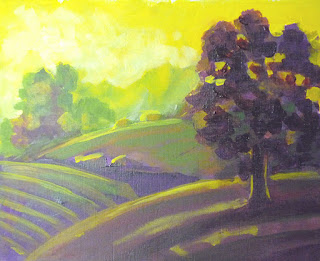
Green Hills
After they all dried, I picked up one of the landscapes and the bird and started developing them. The landscape was another split complementary—red-violet for the main color and yellow and green for the complements. I chose to make the red-violet the dark color this time, with the green for the background and yellow for the sky. When I first brushed them in, I was astounded at the aerial perspective I'd gotten, even with the almost pure colors. The yellow went to the background as I wanted it to. I've had really mixed results with yellow depending on what colors it's with—sometimes it really wants to come forward. As far as its temperature, it really is midway between the hottest and coolest—red-orange and blue-green—perhaps that explains why it can go either way. Anyway, as I worked on the painting I feathered the green and yellow forward into the hills, and took the red-violet softly toward the distance. I added one more color, yellow ochre—after all, it is a yellow—which makes a nice, more neutral accent. This is really the first value study I've ever done.

I've heard lots of people say how instructive it is to paint with a limited palette, but they always choose colors they can mix to get a full spectrum. This is using only 4 colors, but the color combination is anything but full spectrum. And yet it looks rich, full, balancing cool and warm. I don't want to use the word mood to describe the effect; I'd rather say it has a distinct flavor. I guess tone might mean the same thing, but it's too bland and too much like mood.

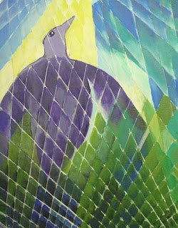
Bird Spirit Rising
 The bird has an analogous color scheme, running from violet through yellow, over half of the color wheel. The yellow adds just a bit of warmth to the fundamentally cool combination. I love blues and greens and violets. (Saving this for the web has shifted the violets on the bird to be a lot more neutral gray.) When I looked at the first pass of the design, I knew it was far too simple, and I didn't want to end up painting feathers. I added the different grid patterns on a whim—after remembering that I'm just playing here. I'm a big fan of several of the early modern painters who interwove their main designs with random patterns to make them more interesting. Even though I think of it as a gimmick, I think it works for this sketch, and it was fun doing it.

I pulled one more trick to take some of the drudgery out of my work—I skipped gessoing any more sheets of watercolor paper and used sheets from a Fredrix canvas pad. I don't really care about the canvas texture, but they stayed much flatter than the gessoed 140 lb. paper. I liked them so much I picked up 3 more pads at the Blick store sale! I've almost forgiven Blick for murdering my Art Media store in Clackamas. Not quite, but almost.

Sunday, January 1, 2012

A limited color palette


Last week I started work on another one of my recent landscape shots, one of the Tualatin River near the historic community of Willamette on an overcast afternoon. I worked on it for a few sessions, trying to make something I liked out of it. In the end I felt happy with the colors I got, and some of the brushwork, but it still falls way short of what I'd like to be able to do. I was looking at one of my favorite books on painting, Ted Goernschner's "The Workshop Experience" and decided I want to do some experimenting with limited color palettes. I wanted to reuse the same composition, using a split complementary color scheme of yellow, red-violet and blue-violet. For the first time, I succeeded in getting some photos of the painting process. I only did one session a day on this, as I needed to take that much time between sessions to screw up my courage and go forward with these rather unfamiliar colors.


The first session was limited to blocking in the larger masses, except for the tree foliage on the left. Not sure why, but I left that till last.


In the second session I worked on the background, the foreground, and the shrub and tree structures.


In the last session, I finally laid down the tree foliage and made a few more adjustments in the shrubs in the foreground.

I'm going to stop here for now, even though it doesn't look finished to me. I want the colors to soak into my brain for a while. Maybe they'll help me grow some new brain cells that aren't bogged down in a rut. I keep thinking of something Carolyn Lewis said in her video, about painting from photos: "Make your painting look better than the photograph."

And by the way, Happy 2012, and I hope it's a great year for everyone!

A frosty solstice


I was running errands in the afternoon of the day after solstice and was surprised to find Oregon City still covered by clouds and ice fog. I went to the college campus to shoot some photos of frost-covered plants. After I parked and was taking pictures I saw an area a quarter mile away where the sun had broken through and was lighting the tops of some trees up like candles. I more or less ran over there, but by the time I got there, another bit of fog cloud had blown in front of the sun. I walked around enjoying the look of everything with its thick coat of frost, hoping the sun would come back out. My shoes got soaked and my fingertips were getting frostbit, but finally it did come out. It stayed out long enough for me to get all the photos I wanted. What a treat!